Iyo Tanowagyu
- Client :
- OTSUKA FARM
- Term :
- 2025
- Works :
- BrandingCi/Vi/BiPackage/ProductsGraphics
 Ci/Vi/Bi
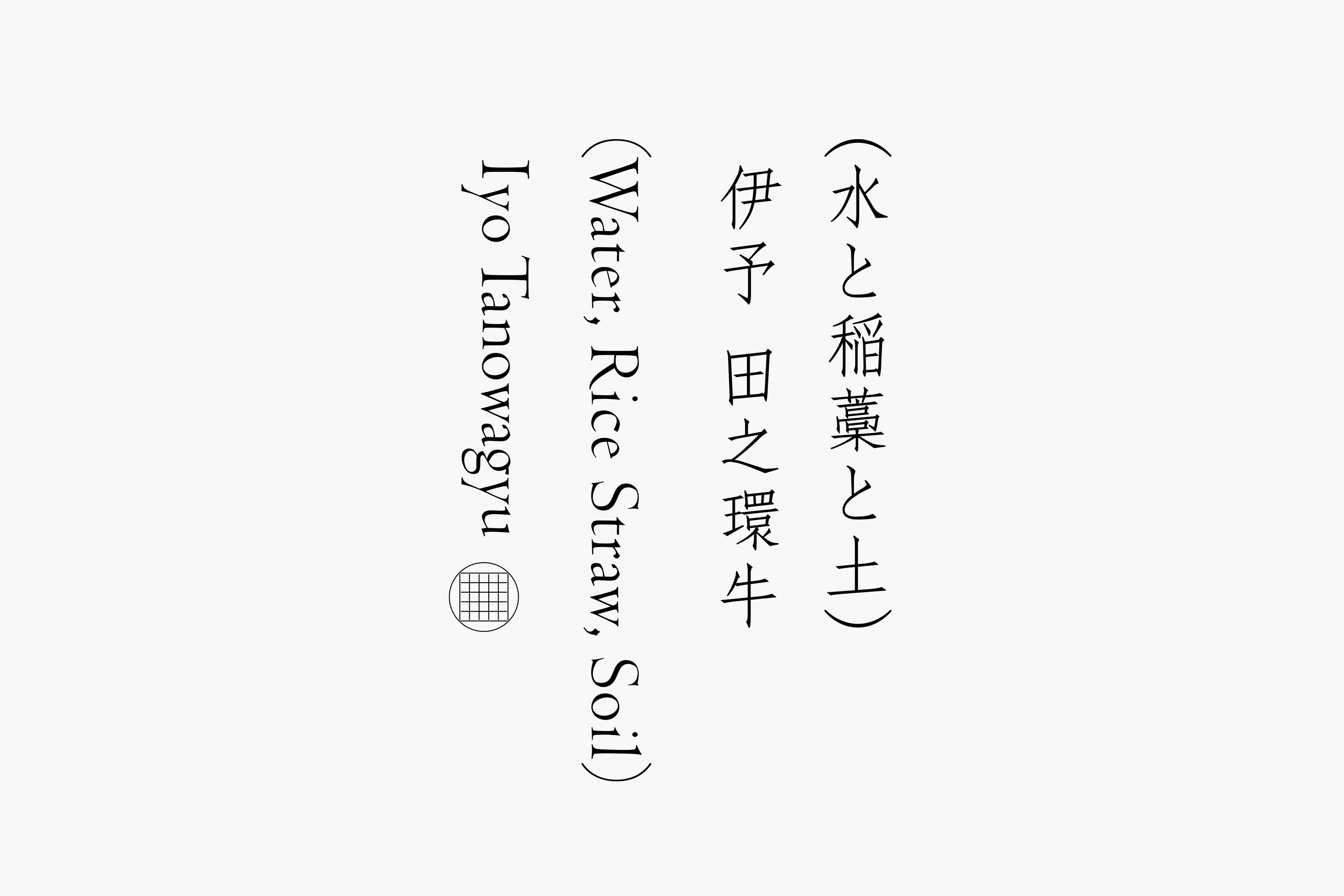 Ci/Vi/Bi
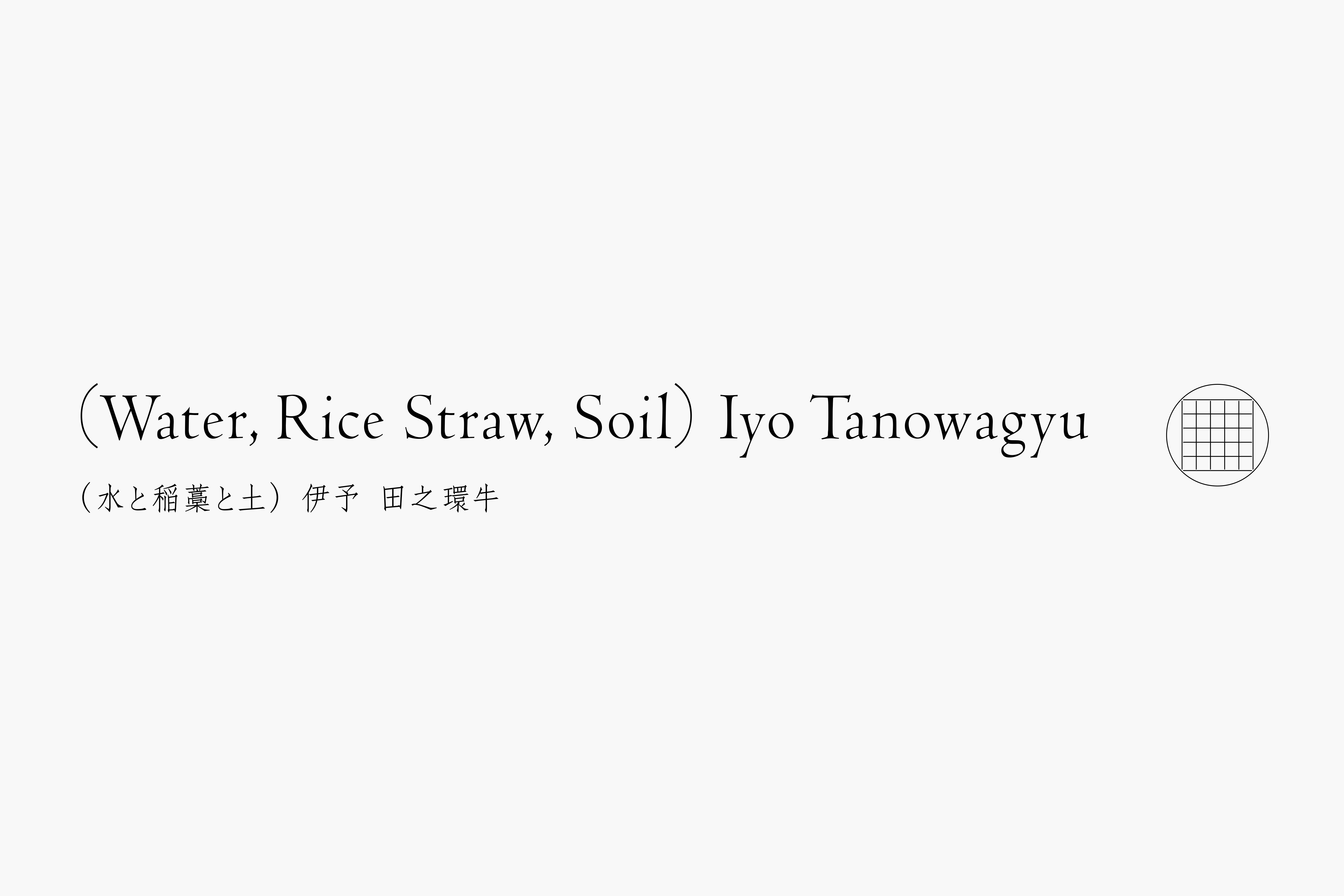 Ci/Vi/Bi
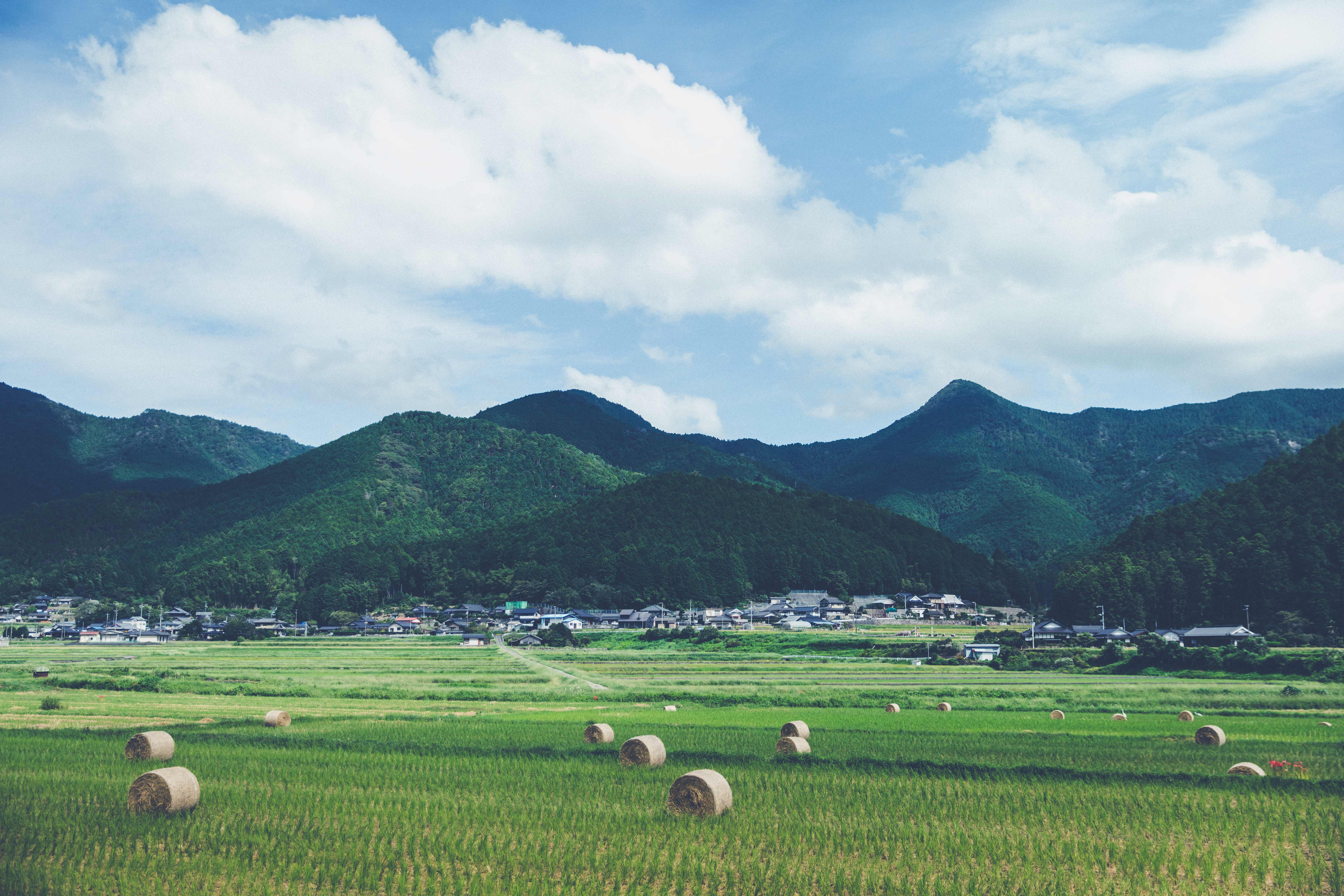 Landscape
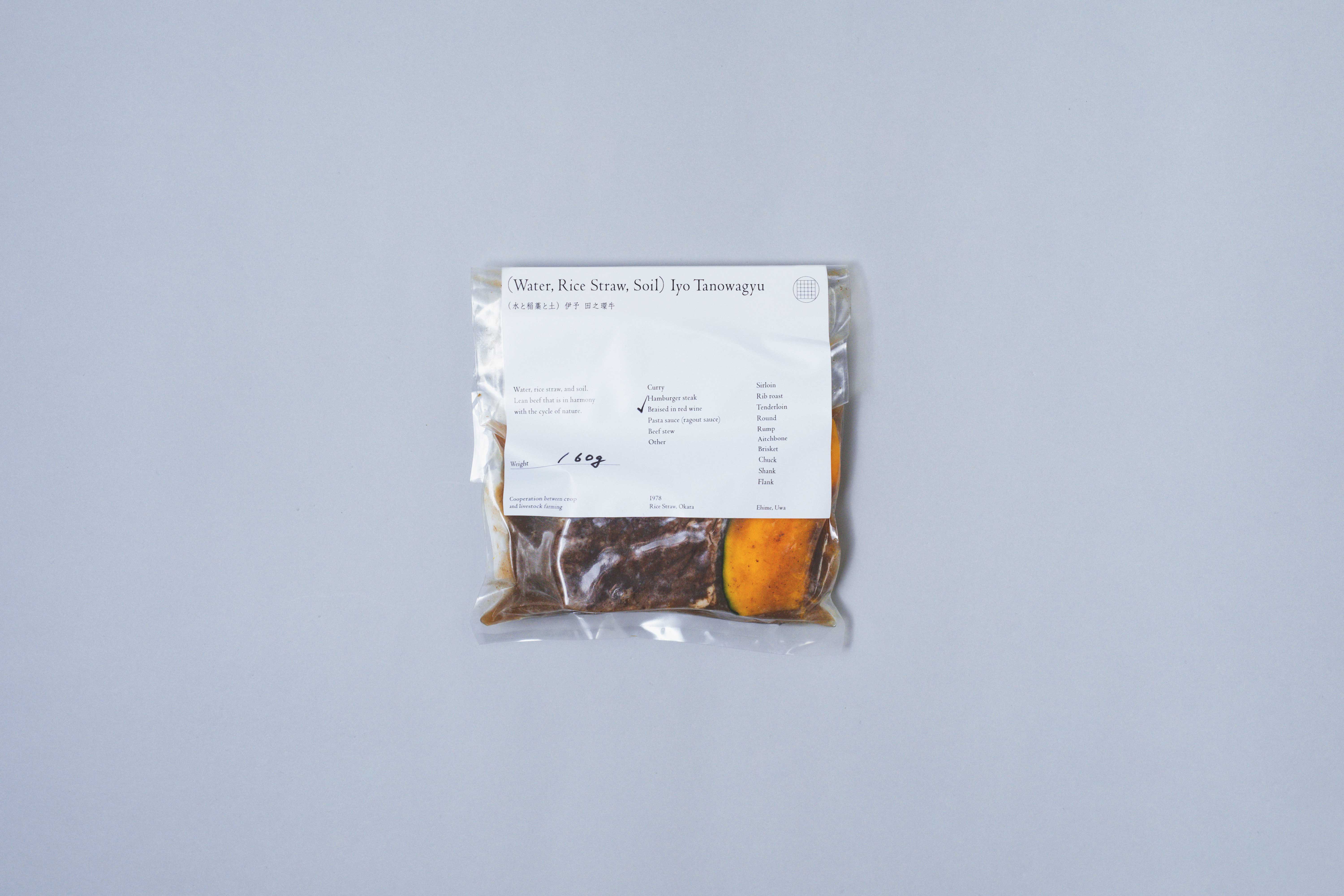 Package
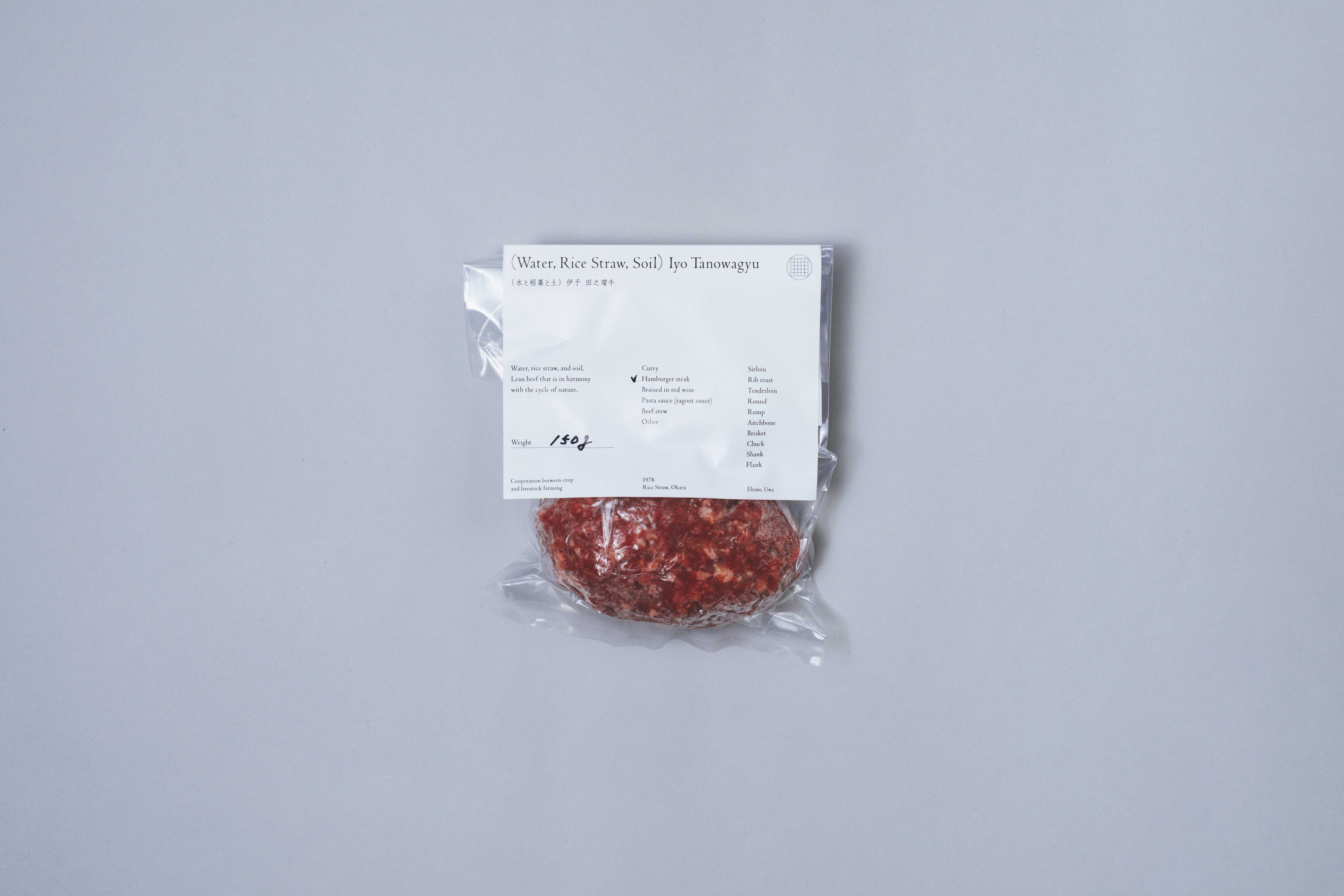 Package
 Package
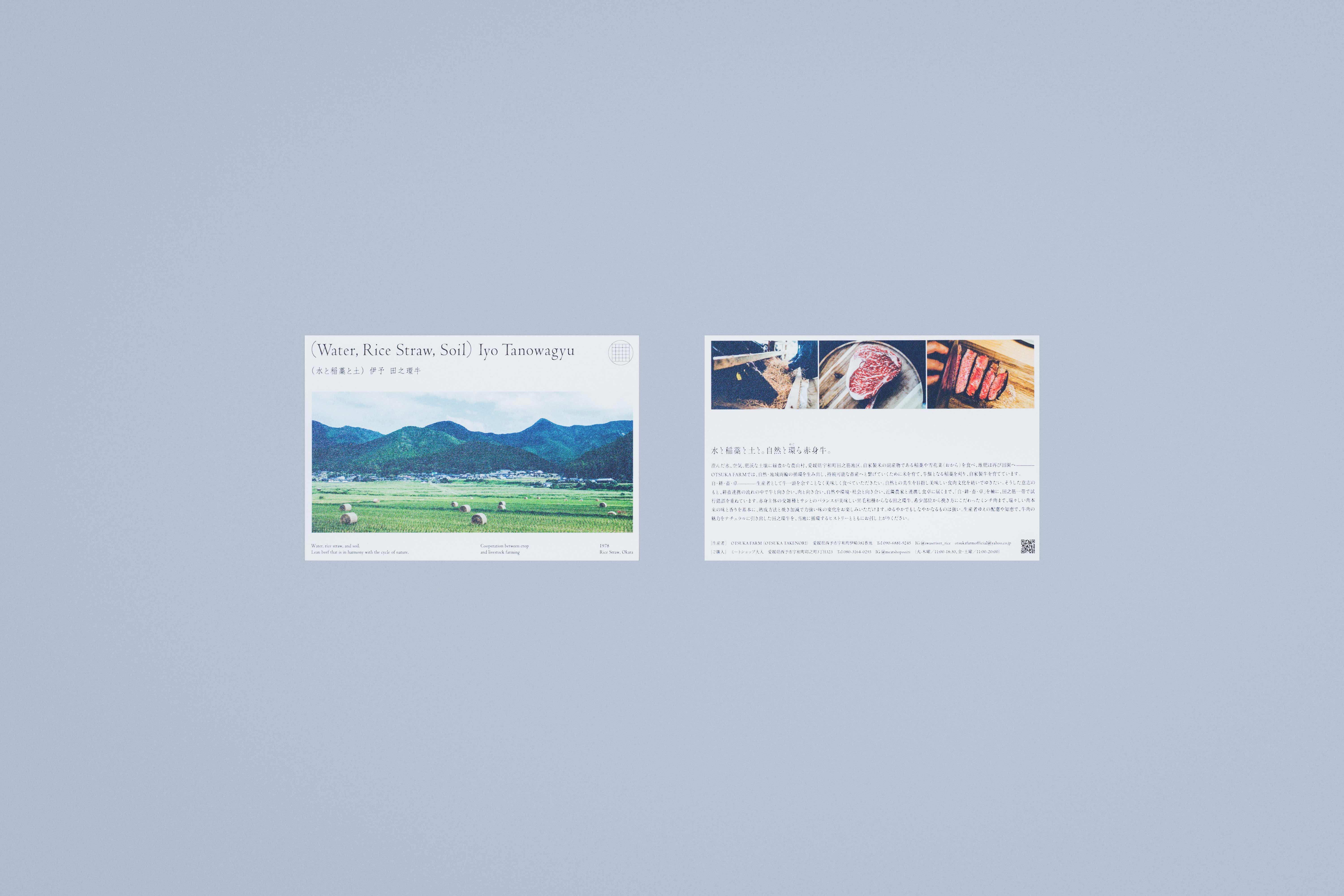 Postcard
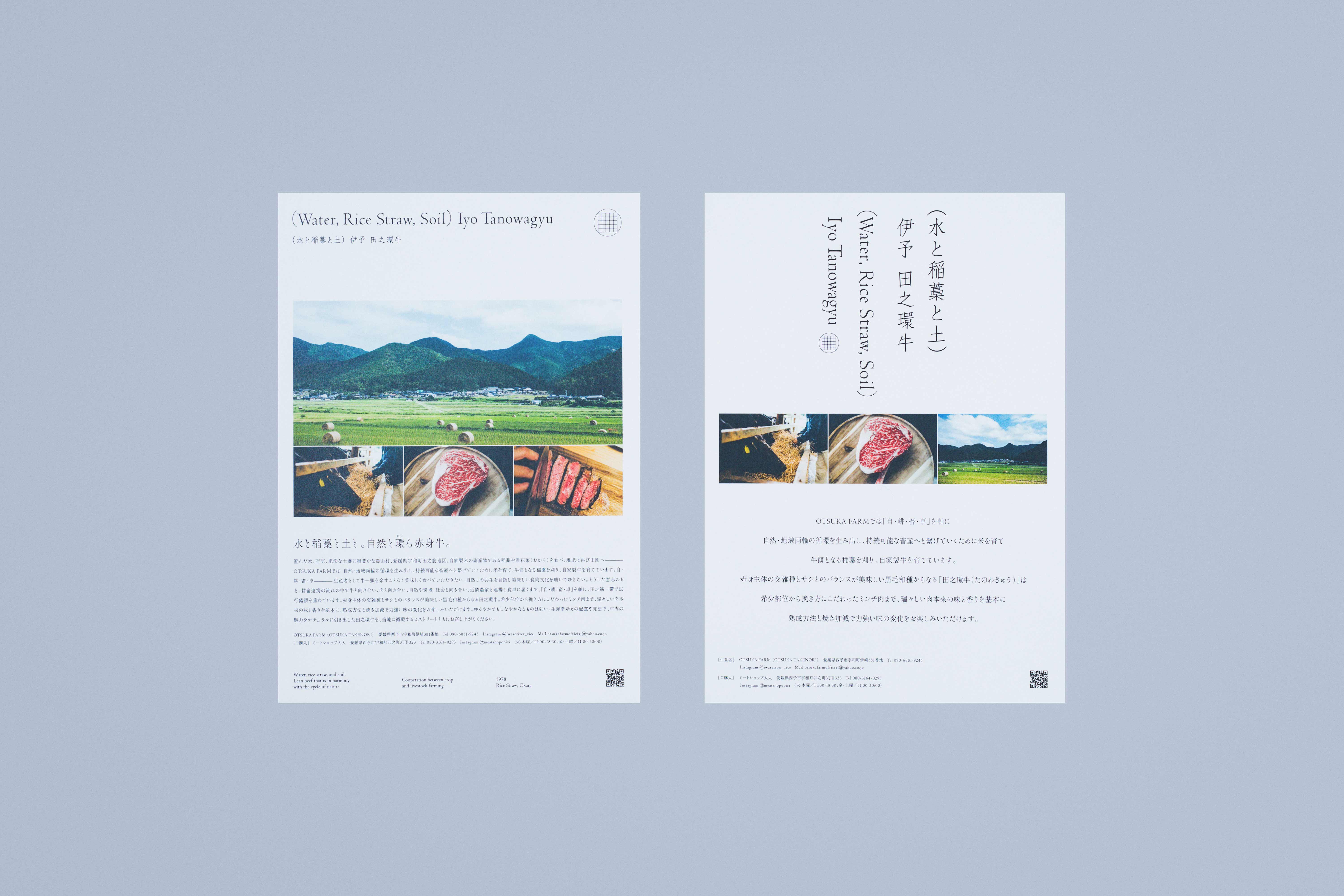 POP
POP
澄んだ水、空気、肥沃な土壌に緑豊かな農山村、愛媛県宇和町田之筋地区。自家製米の副産物である稲藁や雪花菜(おから)を食べ、堆肥は再び田園へ。「OTSUKA FARM」では、自然・地域両輪の循環を生み出し、持続可能な畜産へと繋げていくために米を育て、牛餌となる稲藁を刈り、自家製牛“(水と稲藁と土) 伊予 田之環牛”を育てている。自・耕・畜・卓———— 生産者として牛一頭を余すことなく美味しく食べてもらいたい。自然との共生を目指し美味しい食肉文化を紡いでゆきたい。そうした意志を集約した新たなロゴマークを制作し、パッケージのリニューアル各種ツール等一貫してブランド構築に携わった。
ロゴマークは、当ブランドの特徴である複数の多様な田、田之筋地区を示した格子状のマークと環(わ)を組み合わせ、焼印をイメージしたロゴマークとしている。上下左右のないロゴは、耕畜連携の流れの中で牛と向き合い、肉と向き合い、自然や環境・社会と向き合い、近隣農家と連携し食卓に届くまでの「自・耕・畜・卓」を軸とした、田之筋一帯を表している。パッケージは極力簡素に仕上げ、当地の香りをそのまま感じてもらえるように仕上げた。
ゆるやかでもしなやかなるものは強い。生産者ゆえの配慮や知恵で、牛肉の魅力をナチュラルに引き出した田之環牛。当地に循環するヒストリーは静かに、実直に紡がれている。
Clear water, air, and fertile soil in a lush agricultural and mountain village—the Tanosuji district of Uwacho, Ehime Prefecture.
They eat rice straw and yukihana (okara), by‐products of homegrown rice, and the compost is returned to the fields. At “OTSUKA FARM,” in order to create a circulation of both nature and the local community and to lead to sustainable livestock farming, we cultivate rice, harvest rice straw to serve as cattle feed, and raise our own cattle, “(Water, Rice Straw, and Soil) Iyo Tanowa-gyu.”
Self–Cultivation–Livestock–Table — as producers, we wish to have every part of each cow enjoyed deliciously. We aim to weave a delicious meat culture in coexistence with nature. We produced a new logo mark that encapsulates that determination, and we were consistently involved in brand building through the renewal of packaging and various tools.
The logo mark combines a lattice-like mark representing the multiple, diverse rice fields of the Tanosuji district—a feature of our brand—with a circle (wa), and is designed to evoke the image of a branding iron.
The logo, which has no designated top, bottom, left, or right, represents the entire Tanosuji area centered on “Self–Cultivation–Livestock–Table” — facing the cow in the flow of agricultural and livestock collaboration, facing the meat, facing nature, the environment, and society, and working in conjunction with neighboring farmers until the product reaches the dining table. The packaging is finished as simply as possible so that one may experience the local aroma as it is.
That which is gentle yet supple is strong. With the care and wisdom inherent to producers, Iyo Tanowa-gyu naturally brings out the appeal of beef. The history circulating locally is quietly and sincerely woven.