Ehime University
- Client :
- Ehime University
- Term :
- 2024
- Works :
- Graphics
 Poster
 Poster
 Poster
Ehime University, a national university corporation, aims to contribute to the improvement of the intellectual and cultural level of society through its educational and research activities, and to develop human resources who will contribute to the development of Ehime, its hometown, under the concept of “Ehime University, moving the region and connecting with the world. Ehime University’s student-centered, relaxed, and open school culture attracts talented global students not only from Ehime, but also from all over Japan and other countries.
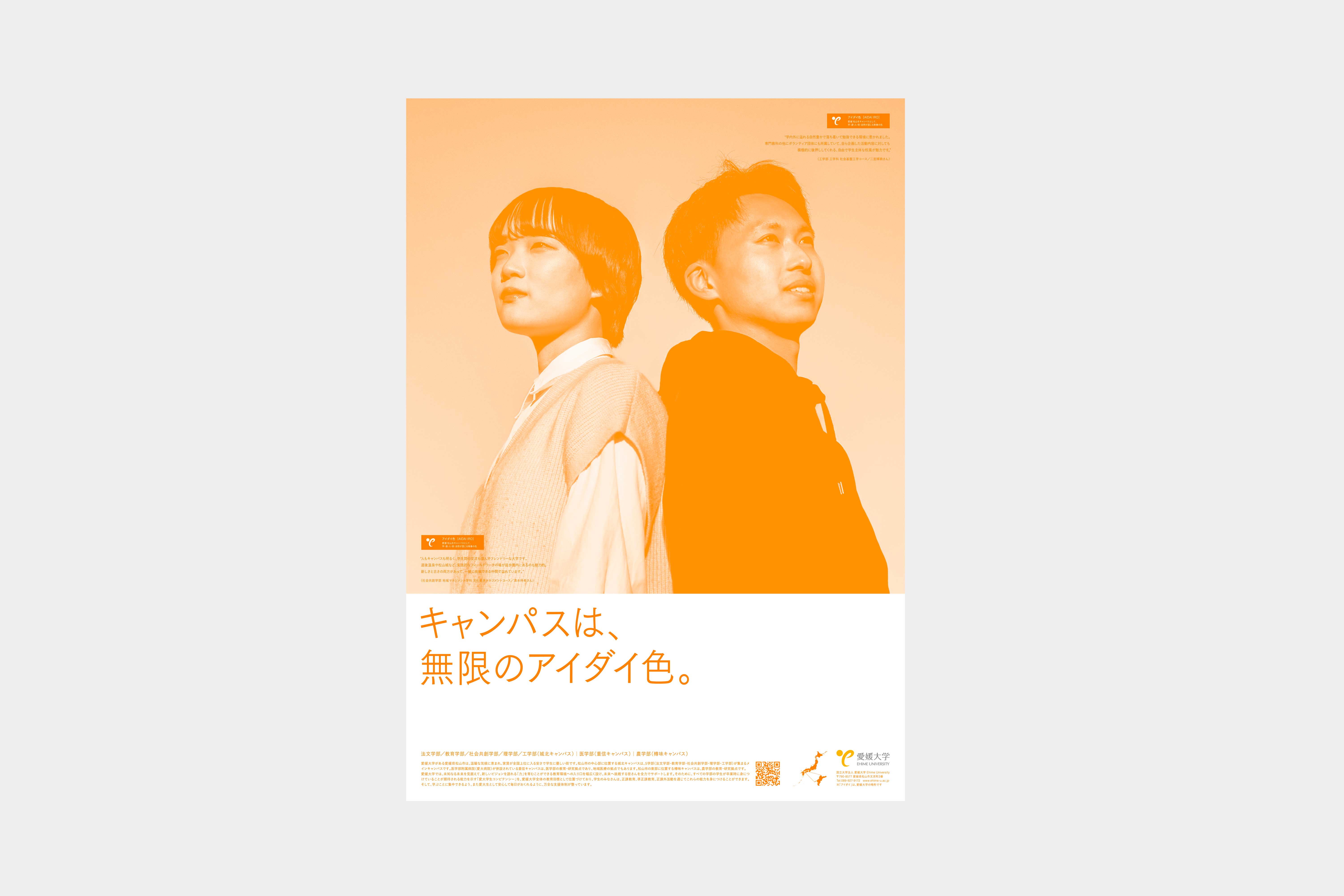
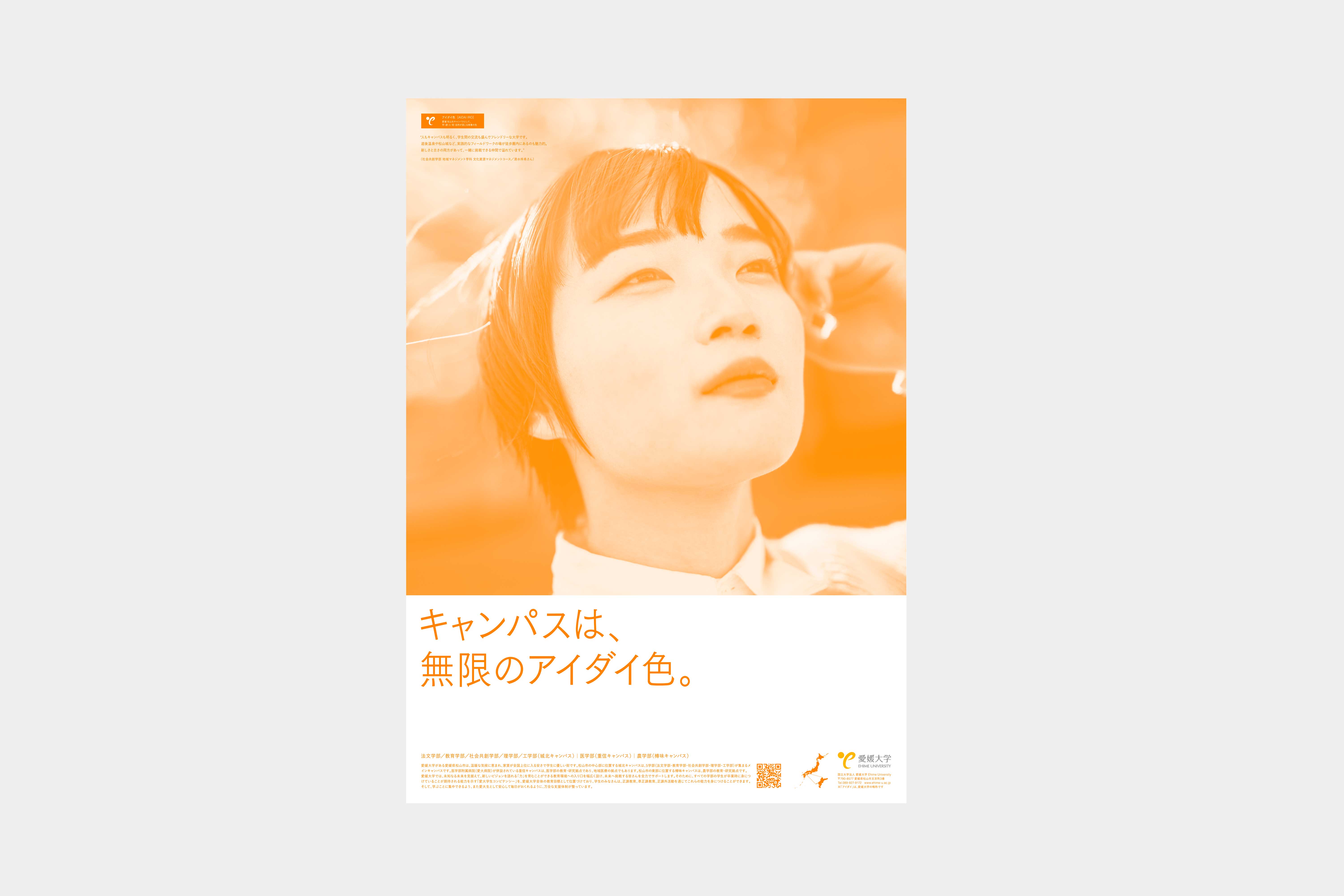
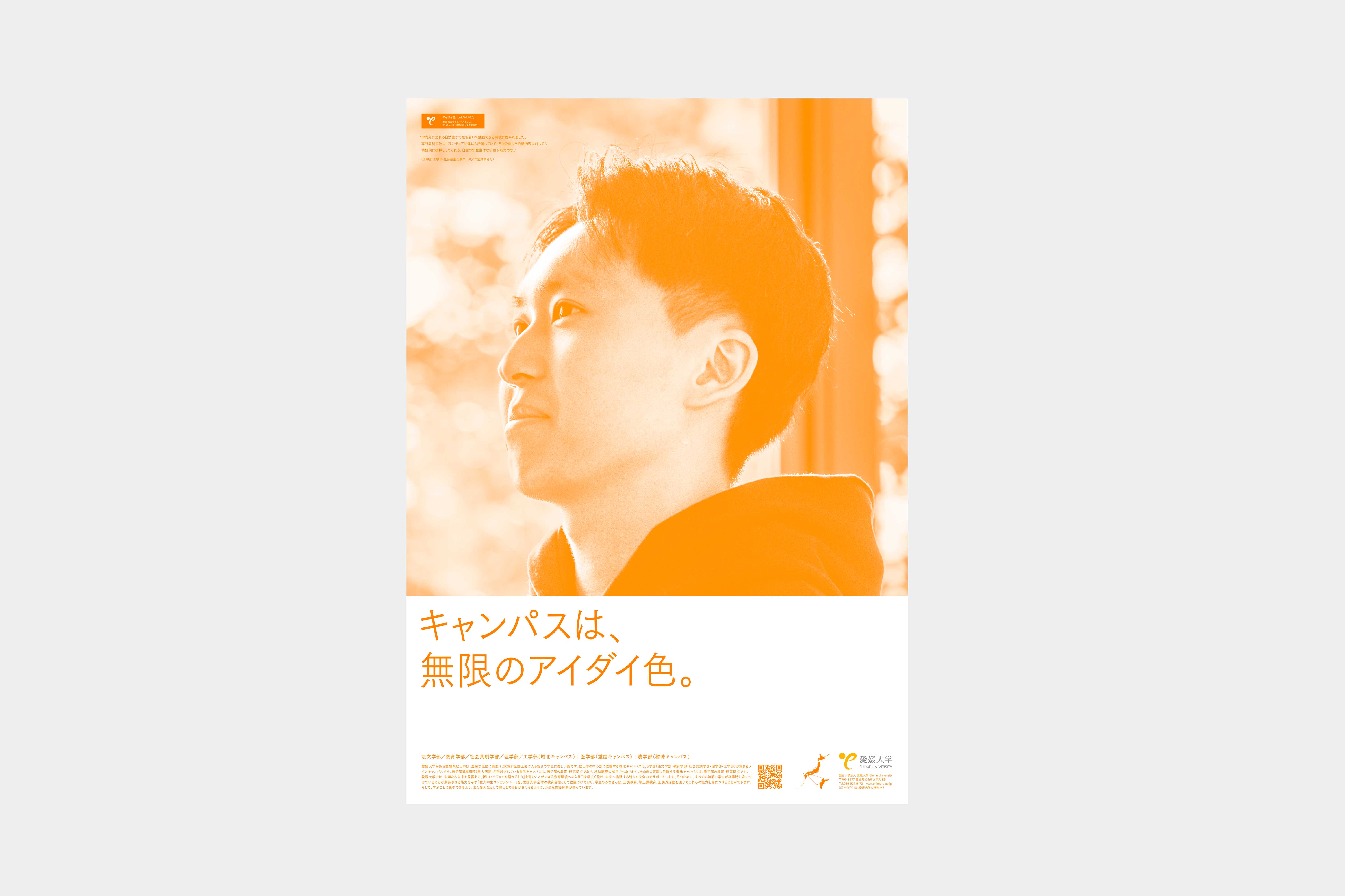
We were involved in the production of a poster visual for publicity purposes, with the aim of attracting students to the school in the 2025 academic year. What is the charm of Ehime University? We were asked to create a concept that would serve as the axis of such a project. The project began with discussions with current students and faculty members on the concept that would form the axis of the project. As we unraveled the concept, we came up with a variety of aspects of student life that differ from one person to another, such as a location with a good balance between nature and the city, a calm school culture that encourages challenge, and a variety of experiences that go beyond classroom learning. These attractions were combined with “Daidai-iro,” which represents Ehime, and redefined as “aidai-iro” in the copy, which became the core of the project. The visuals, including the photographs, were all in orange, a color that naturally differentiates AIDAI from other schools. The posters were also designed to be more appealing not only individually, but also as a series of posters, with the male, female, and paired posters.