Umineko-do
- Client :
- Umineko-do
- Term :
- 2023-
- Works :
- BrandingCi/Vi/BiPackage/ProductsGraphicsWebSpace
 Ci/Vi/Bi
 Ci/Vi/Bi
 Ci/Vi/Bi
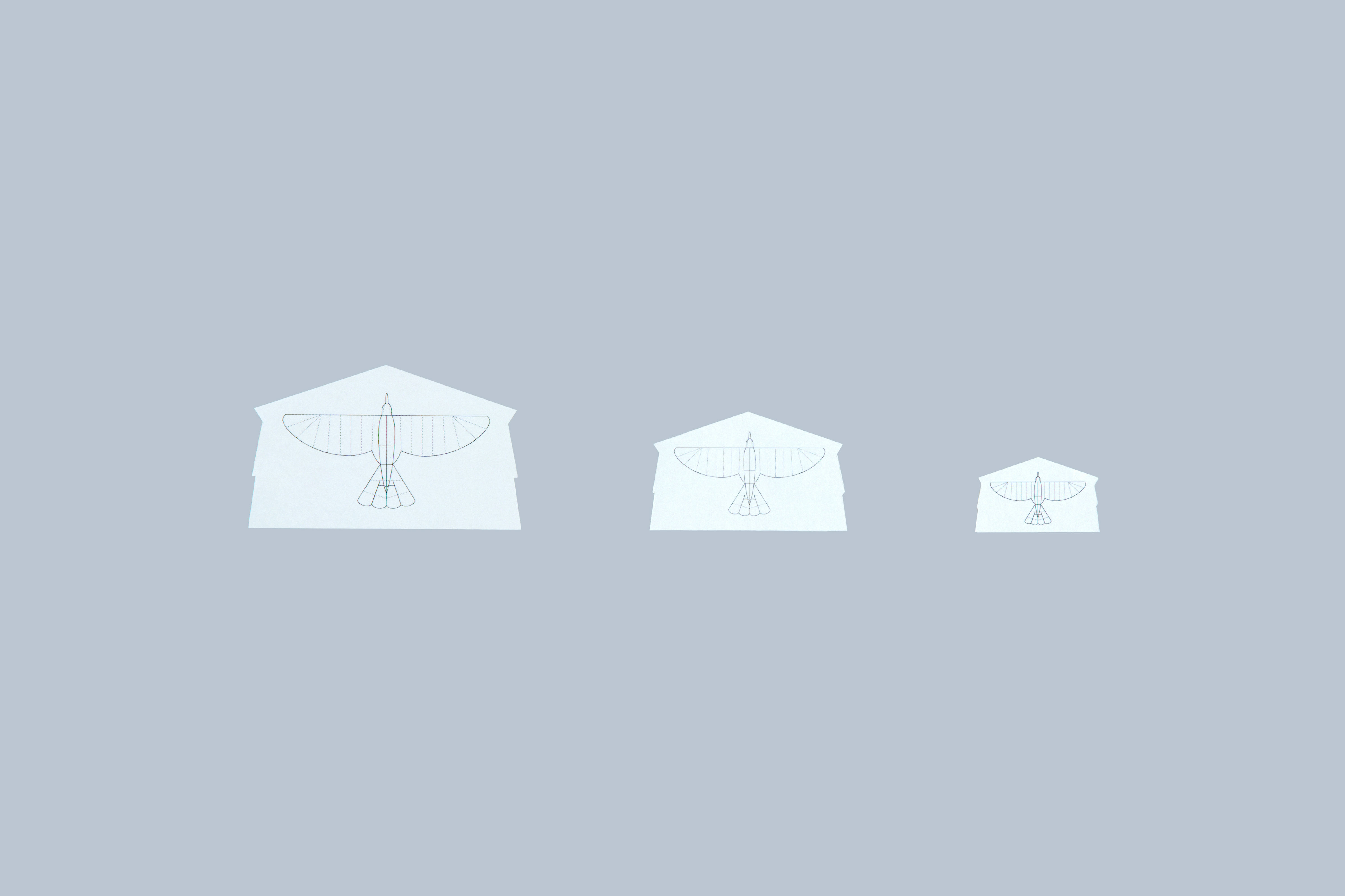
 Shop Card
 Label
Label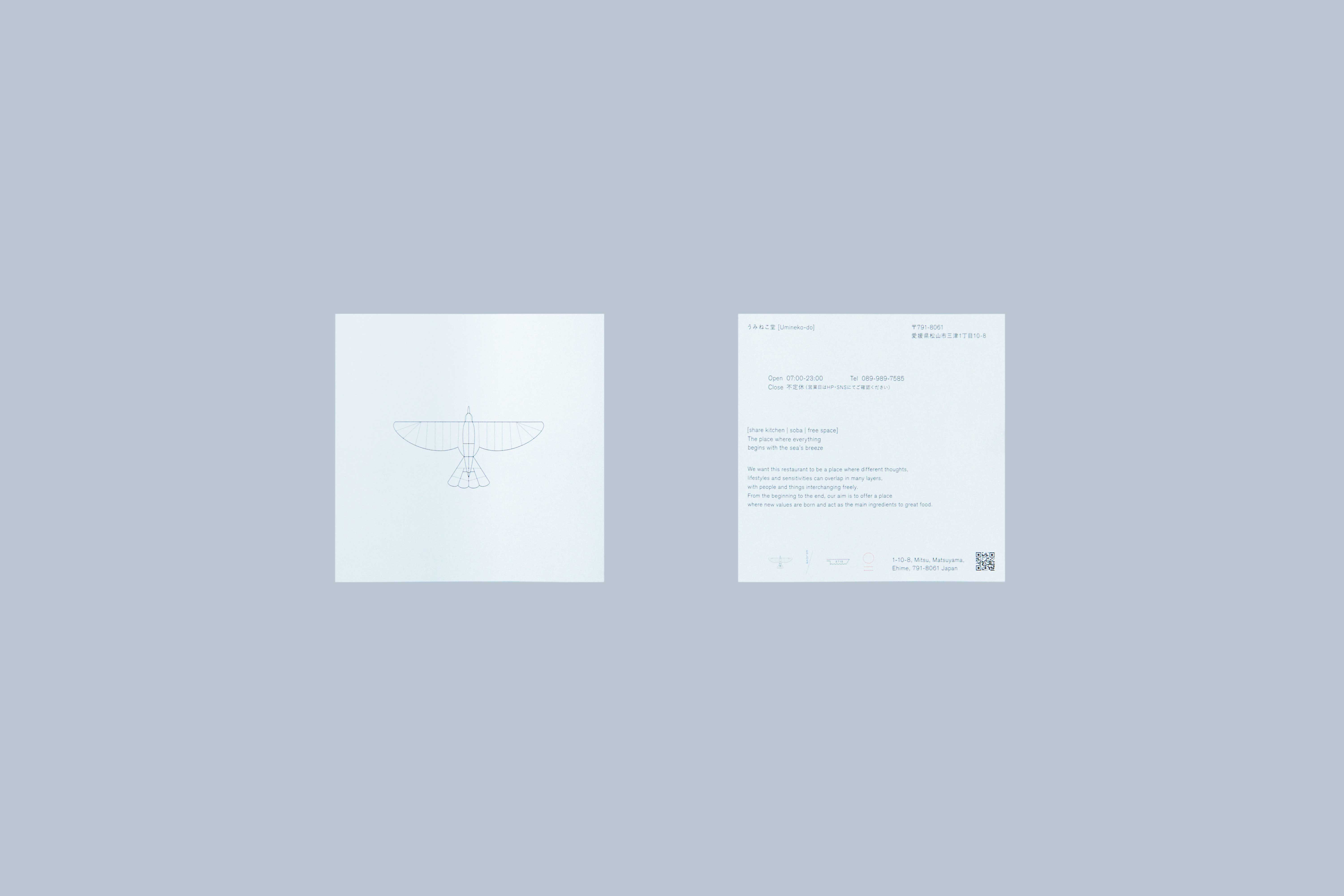 Leaflet
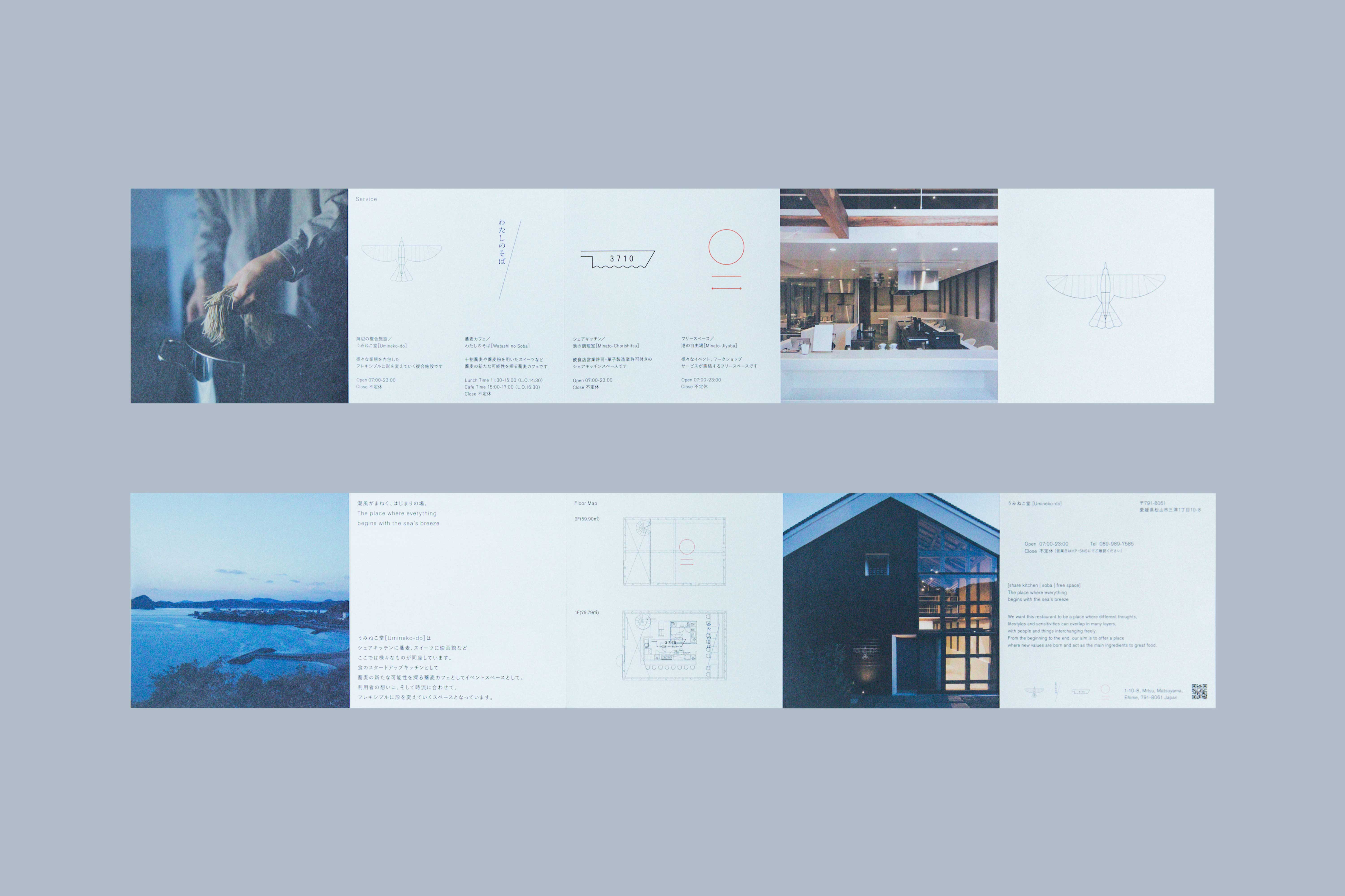 Leaflet
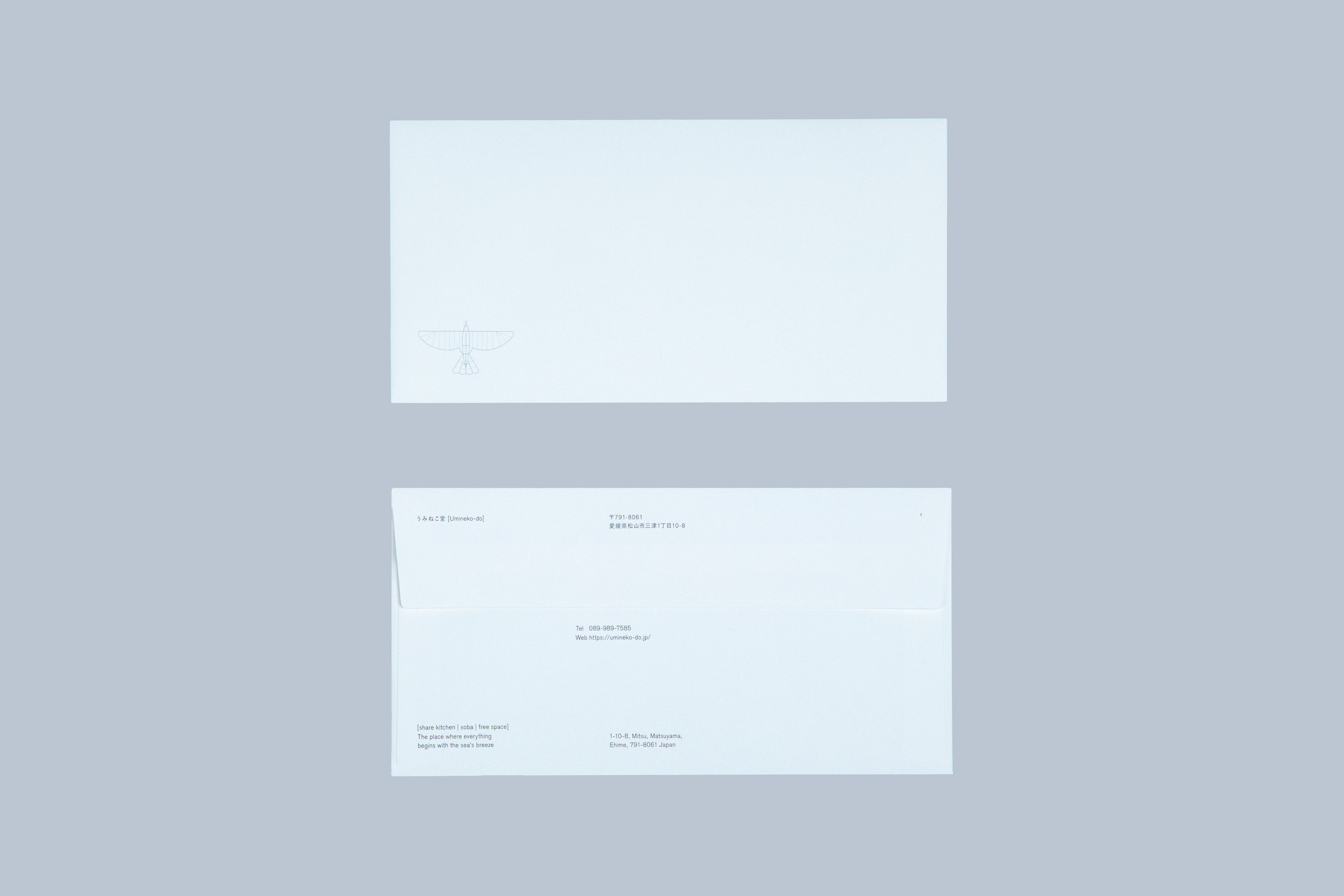 Envelope
 Wrapping Paper
 Sign
Sign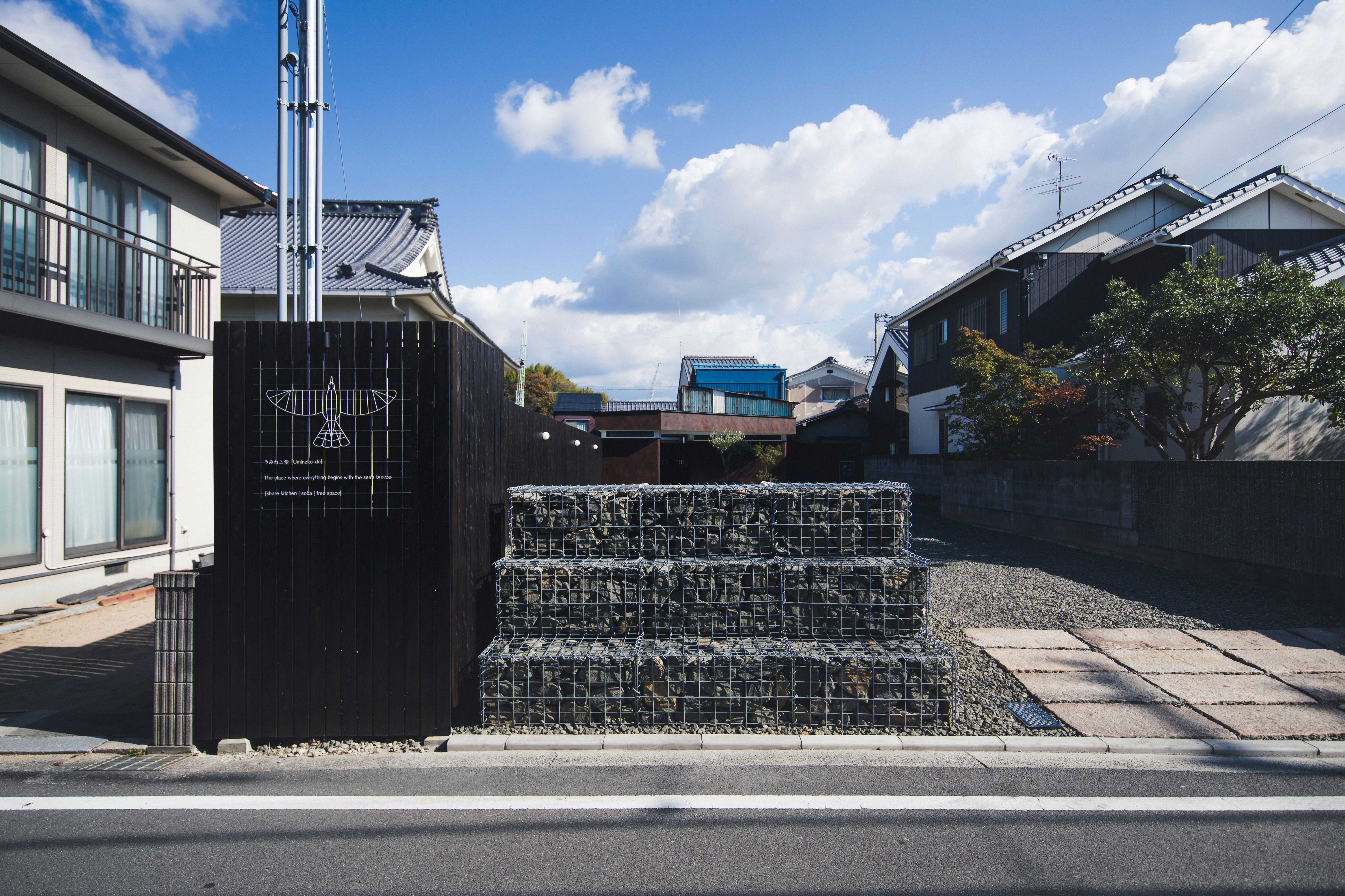 Sign
Sign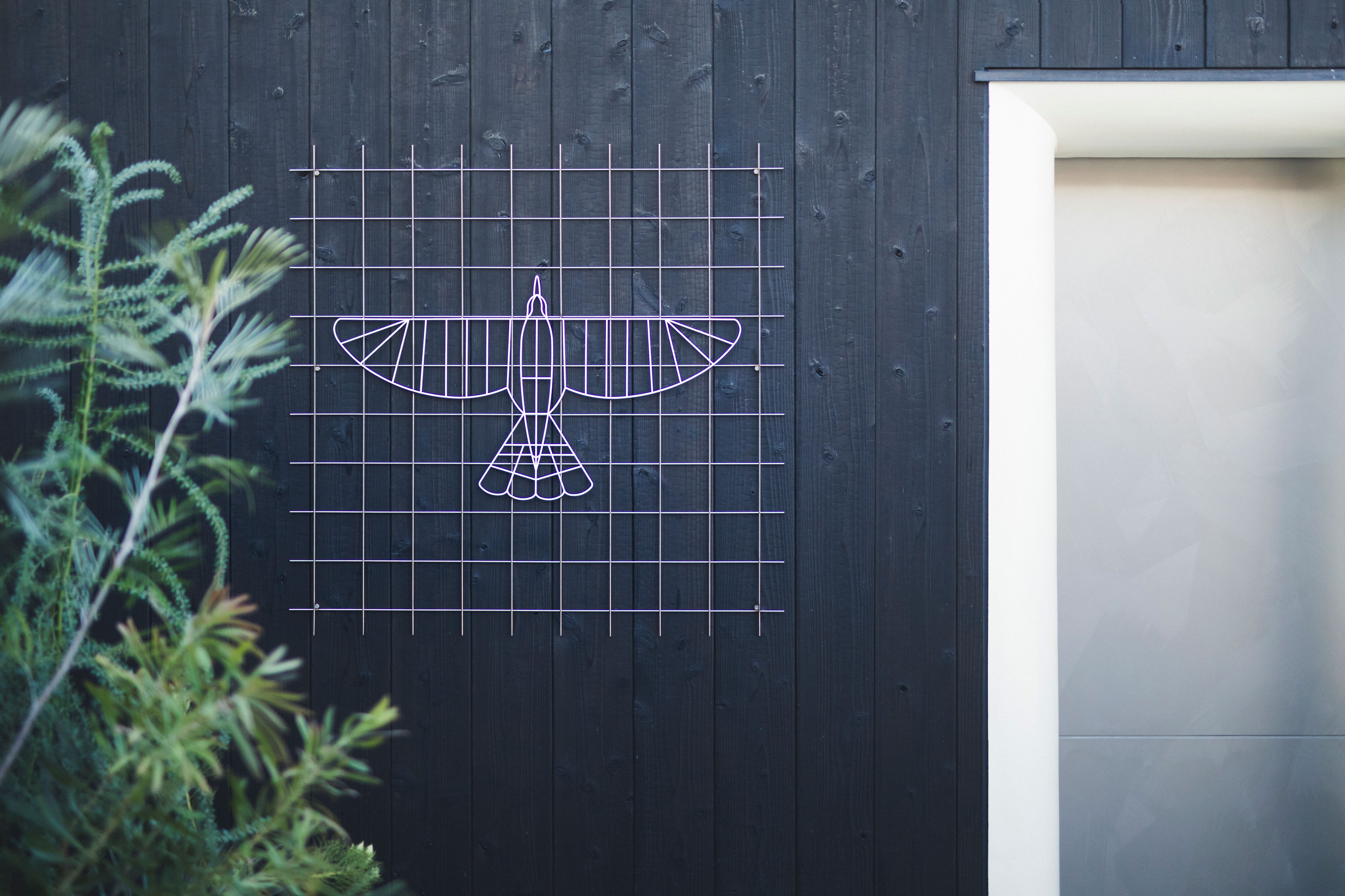 Sign
Sign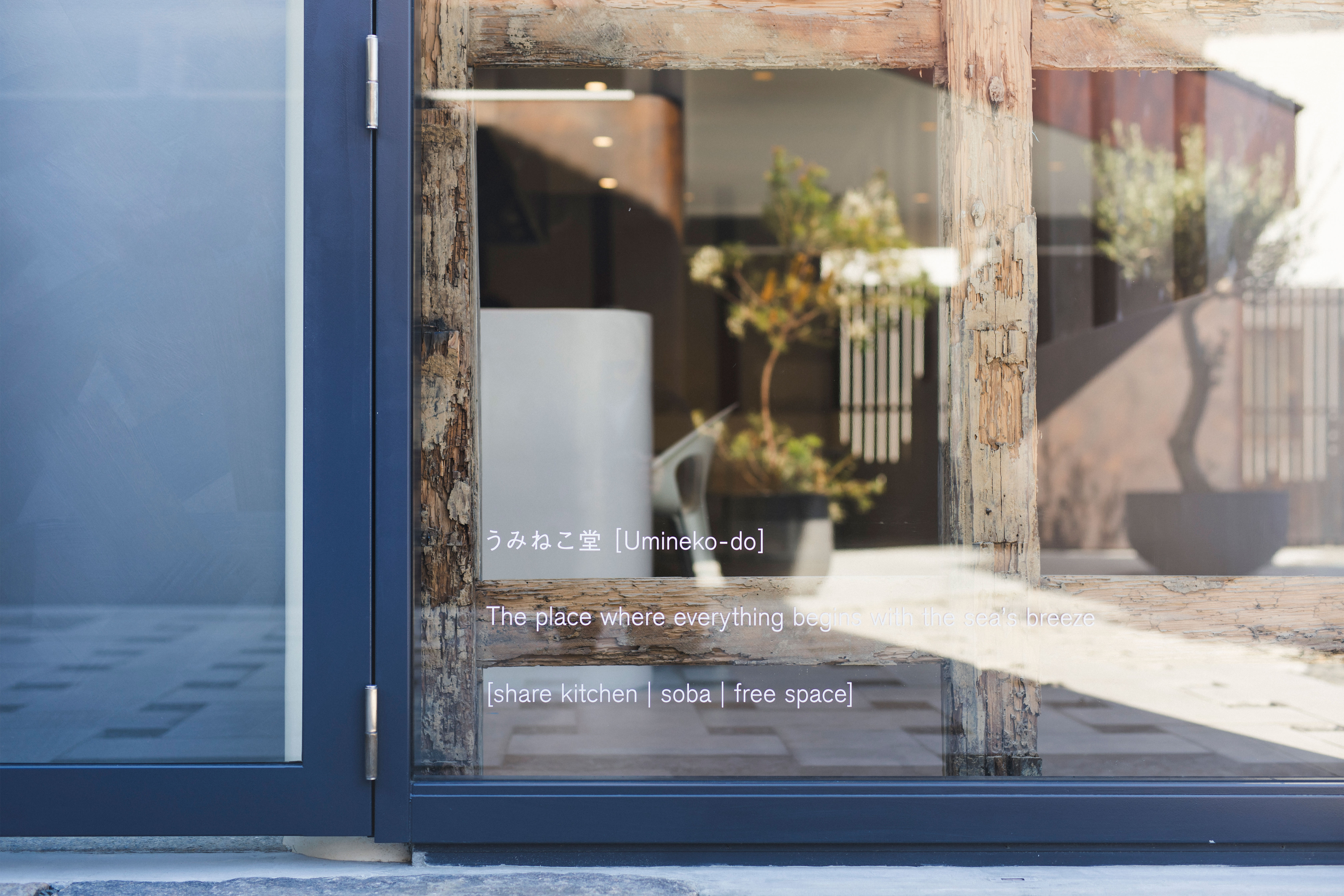 Sign
Sign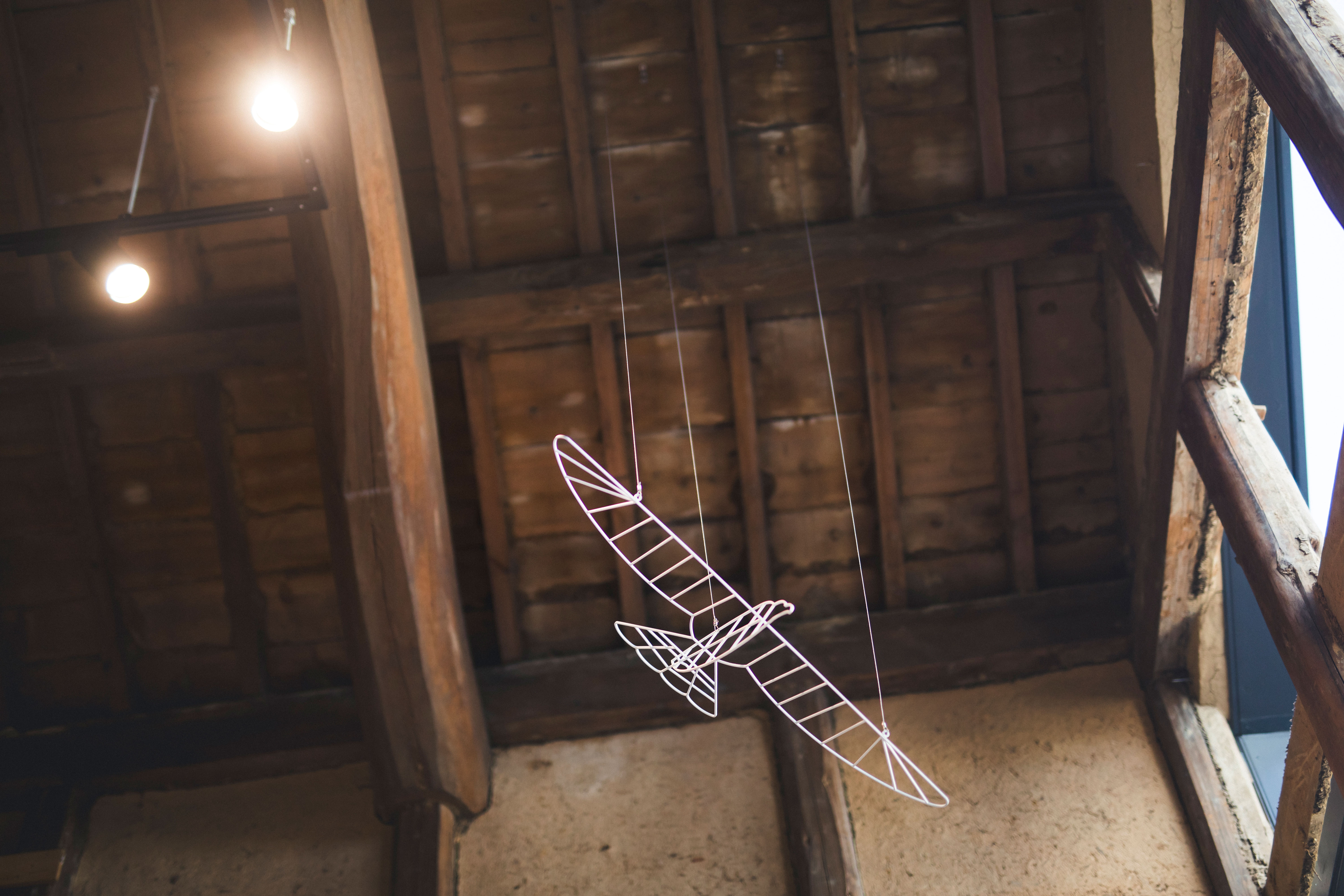 Sign
Sign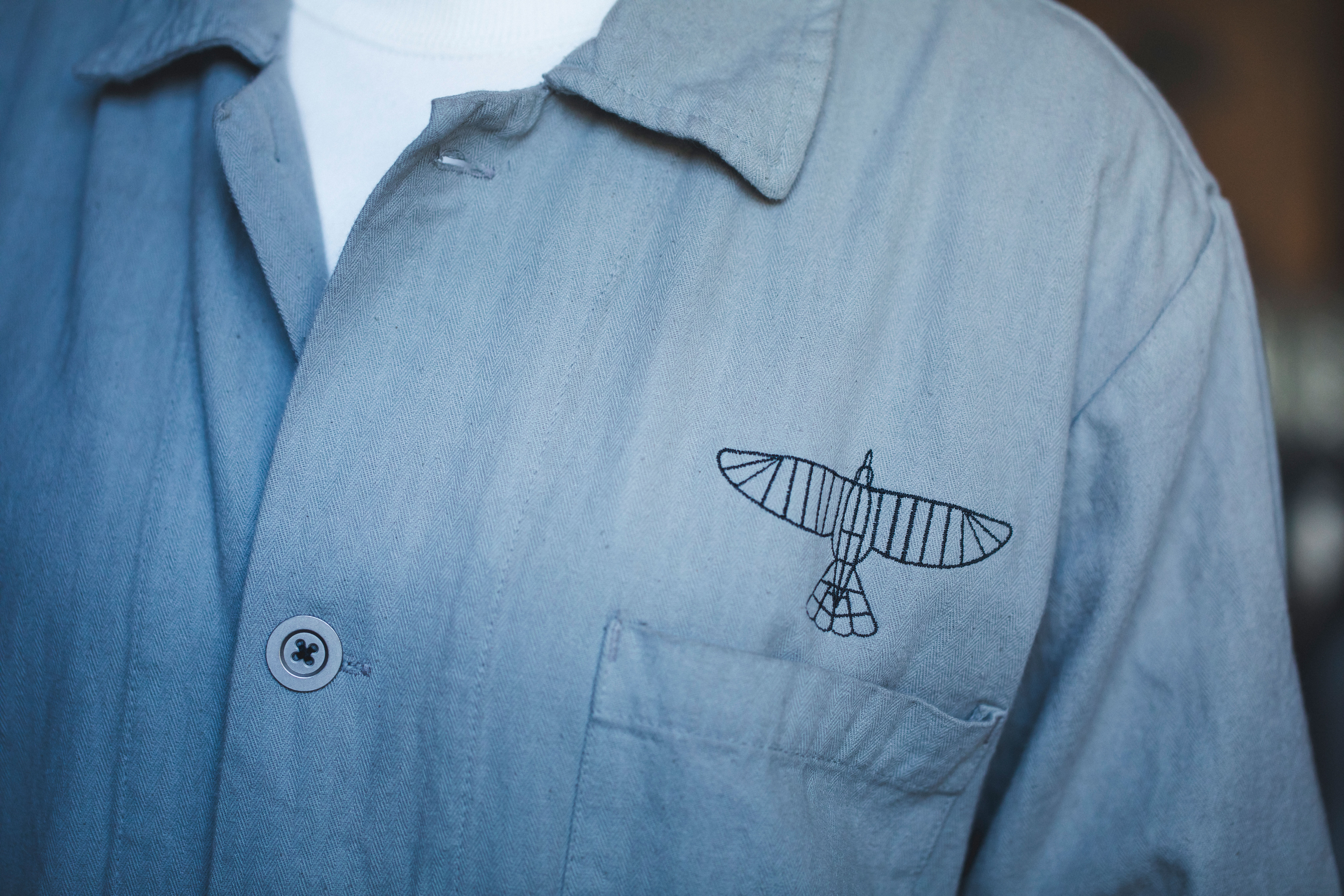 Sign
Sign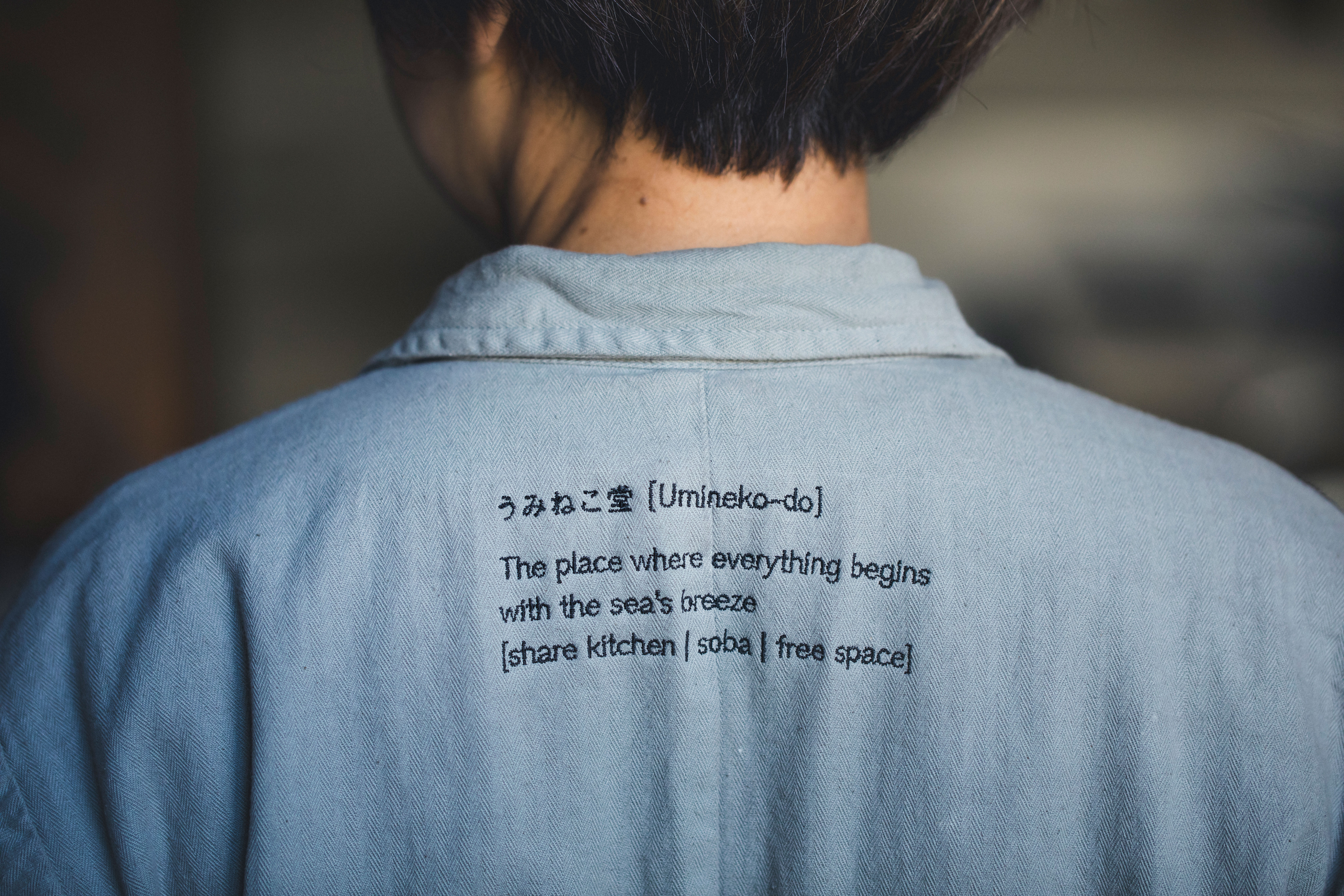 Sign
Sign-
 Web
Web
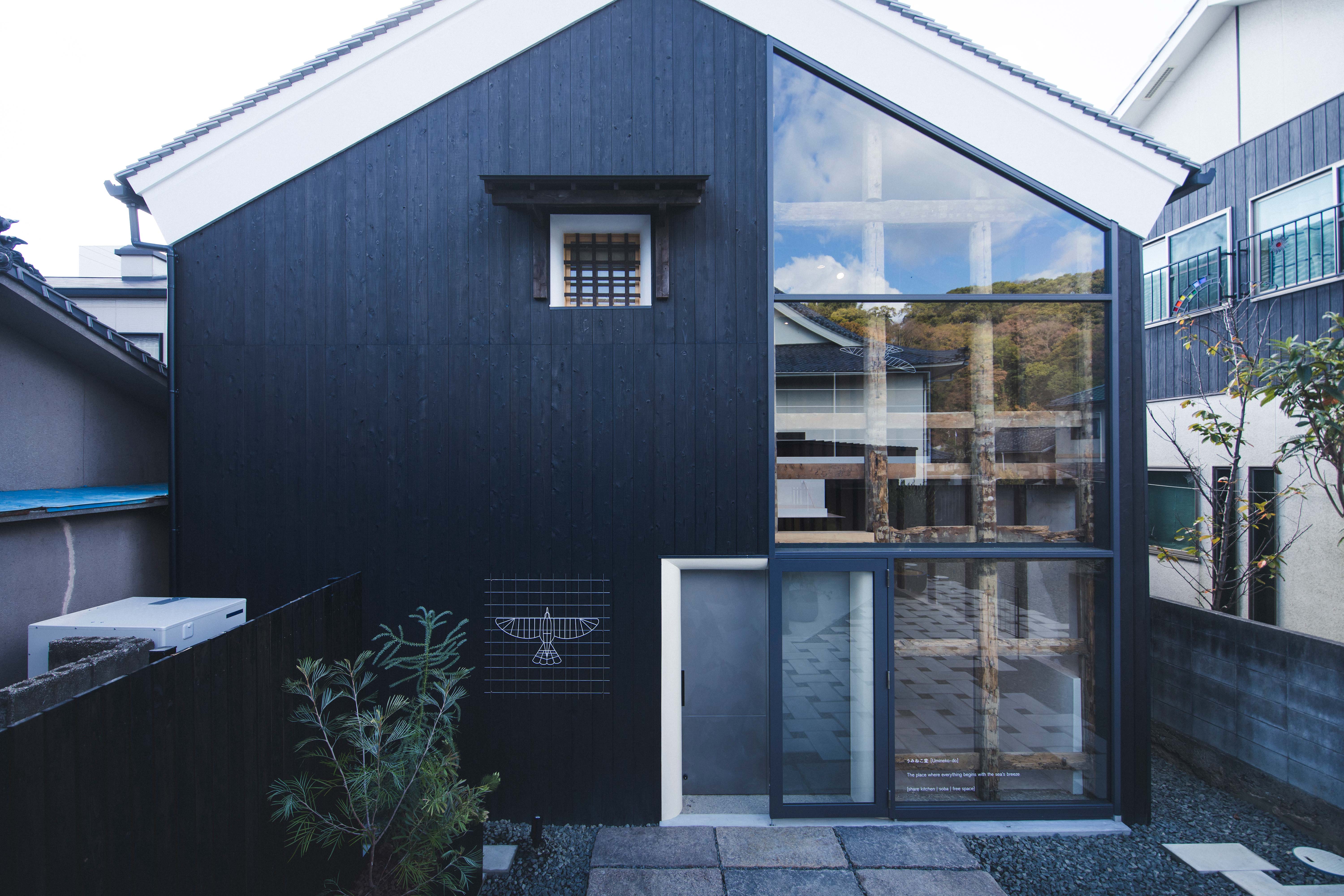
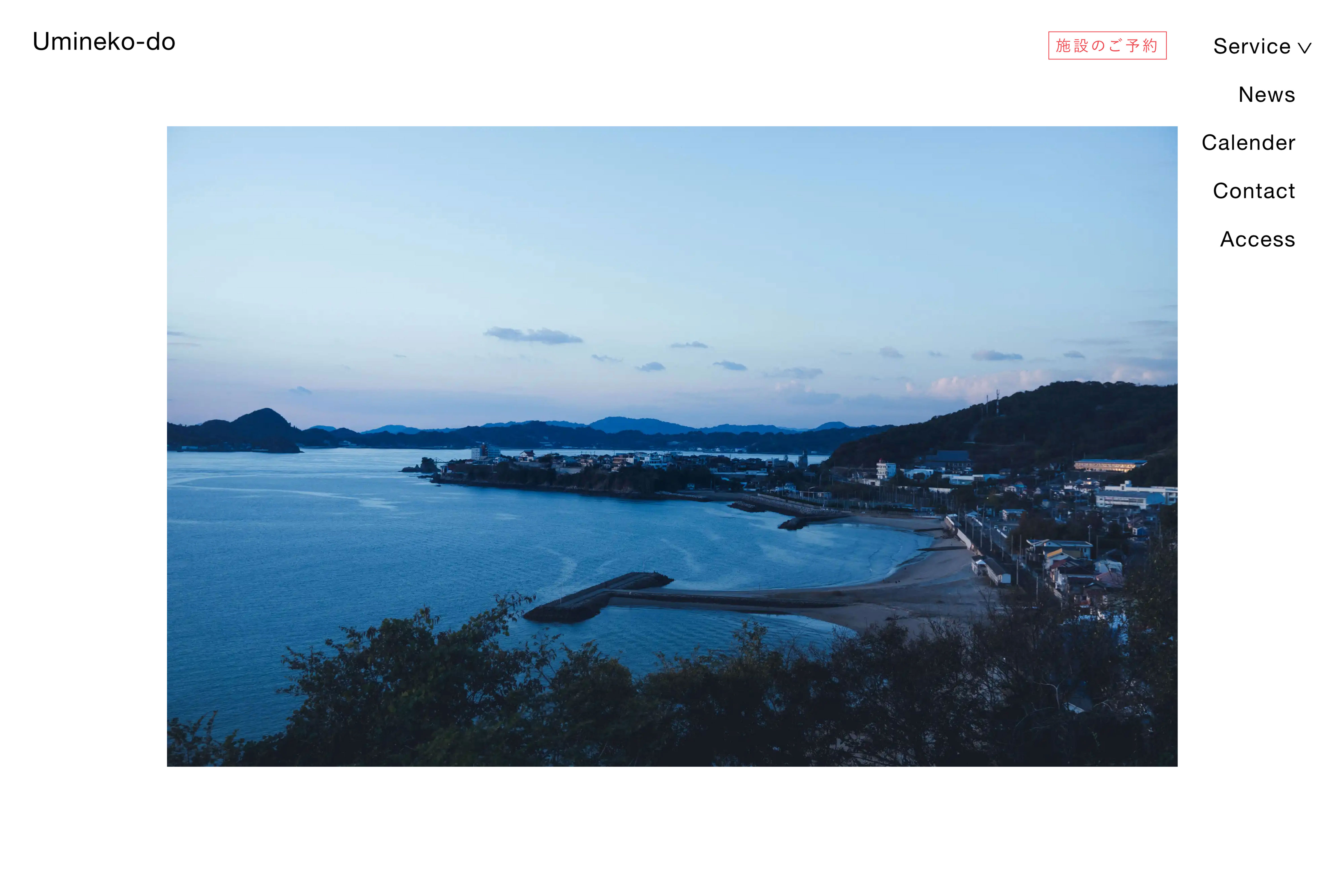
愛媛 松山の港町、三津浜にある築110年を超える土蔵を活かした、シェアキッチン・フリースペース等の複合施設「うみねこ堂」。「潮風がまねく、はじまりの場」をコンセプトに、様々な人・もの・価値が集まり、広がっていくスペースとなるよう、各種ロゴマークからツールやプロダクト、各種サインまで一貫して携わった。
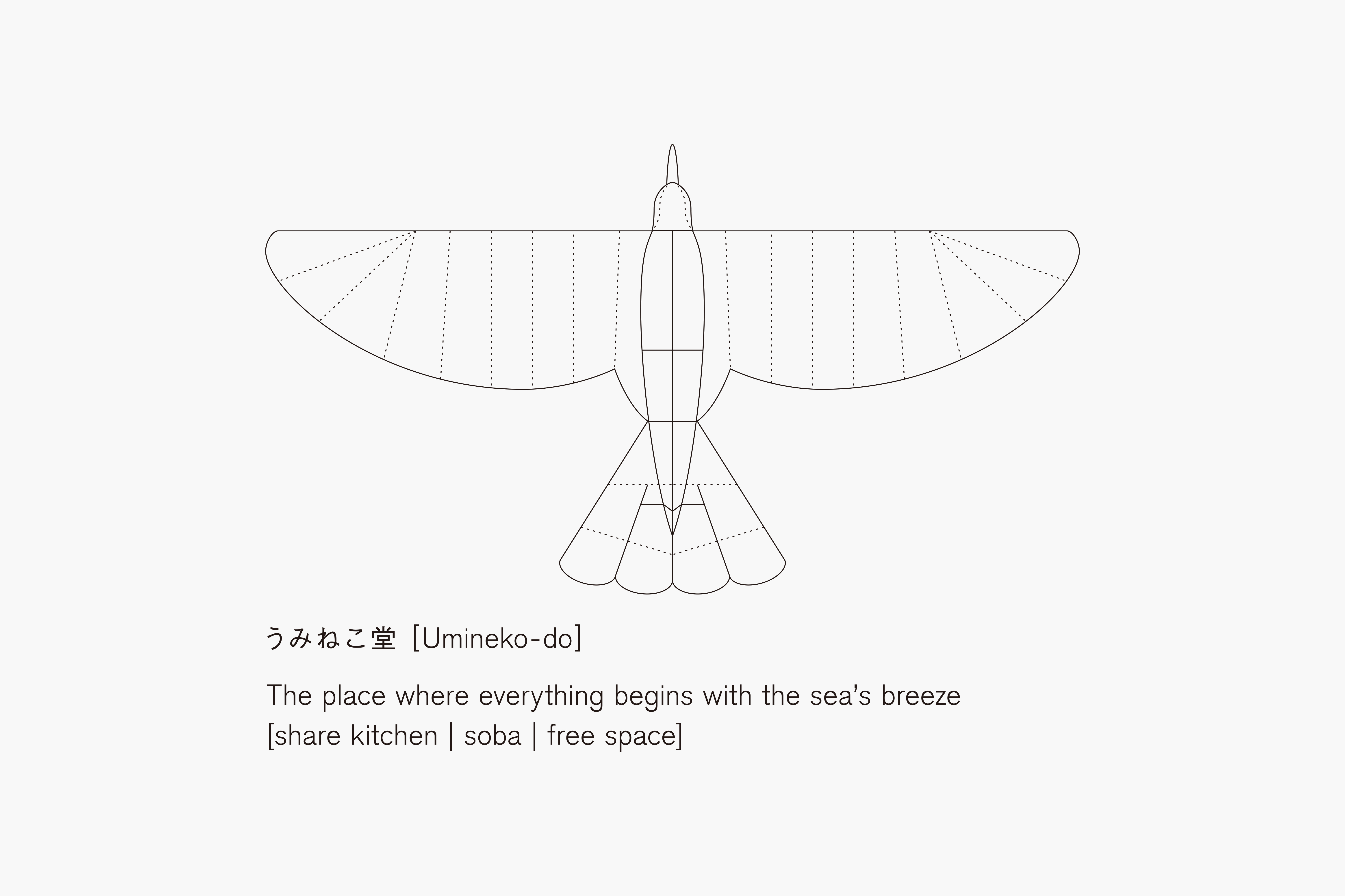
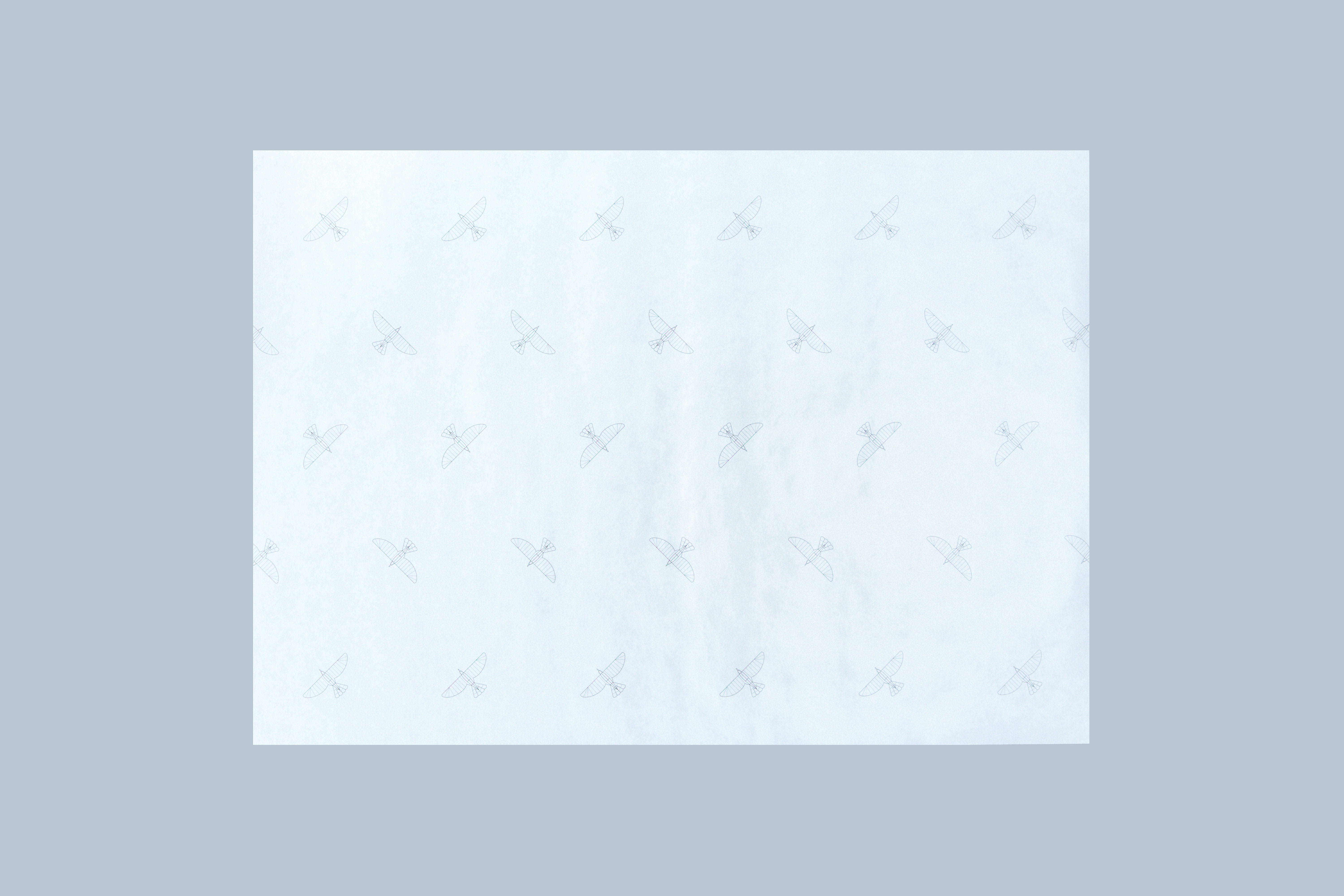
うみねこ(海猫)をモチーフにしたロゴマークは、模型図調の表現とすることで、親しみやすさやラボラトリー的なニュアンスを付加。モチーフであるうみねこには、この場から様々な可能性や新しい価値観が羽ばたいていく様子を込めた。
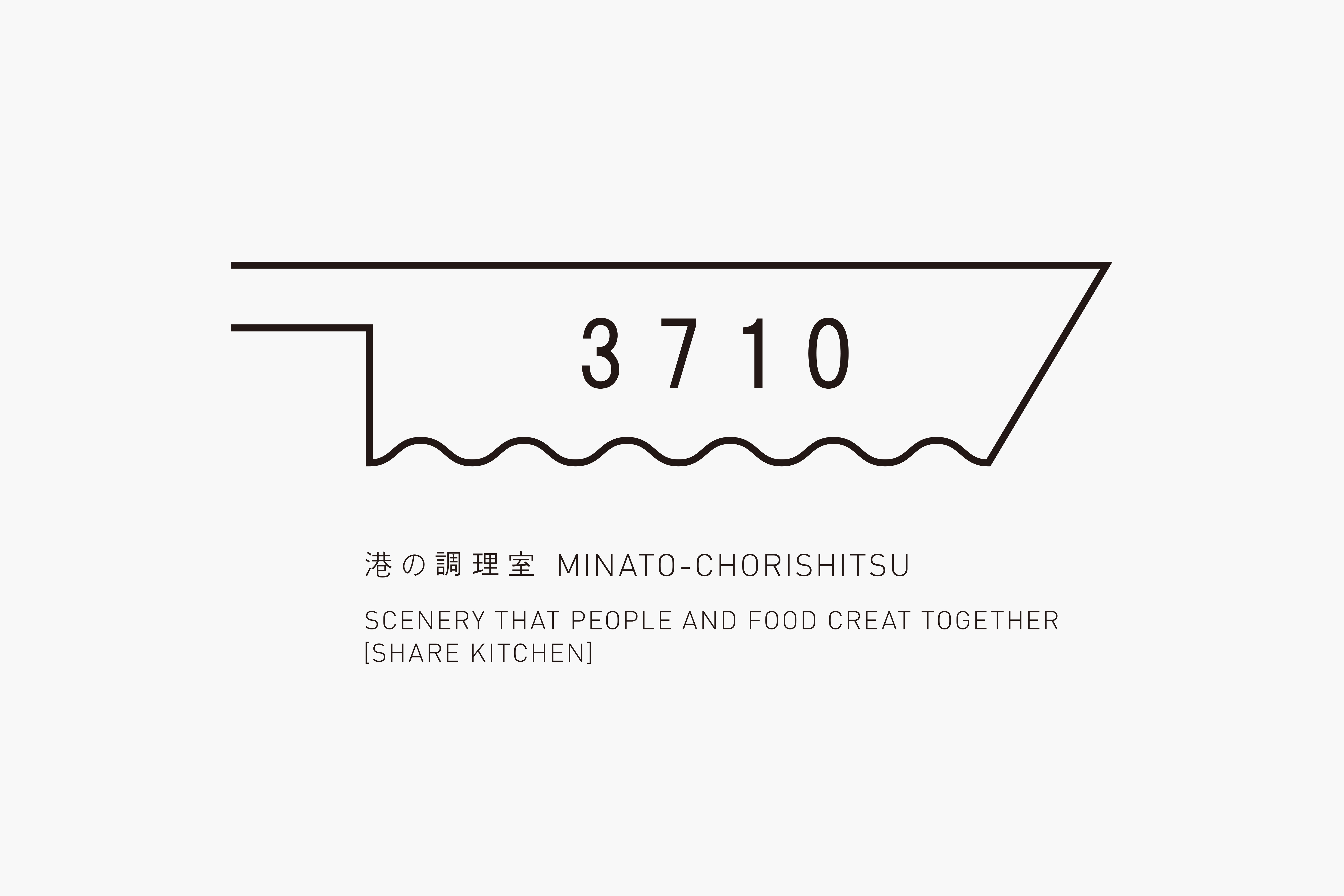
また、施設内に内包される飲食店営業許可・菓子製造許可付きシェアキッチンである「港の調理室」。フード系スタートアップの場・機会提供となるこの場所を、調理室を想像させる包丁と、港を想像させる波と船をモチーフとしたロゴマークで表現した。また、3710は「みなと」を表しており、記号的な表現で印象に残るデザインとした。
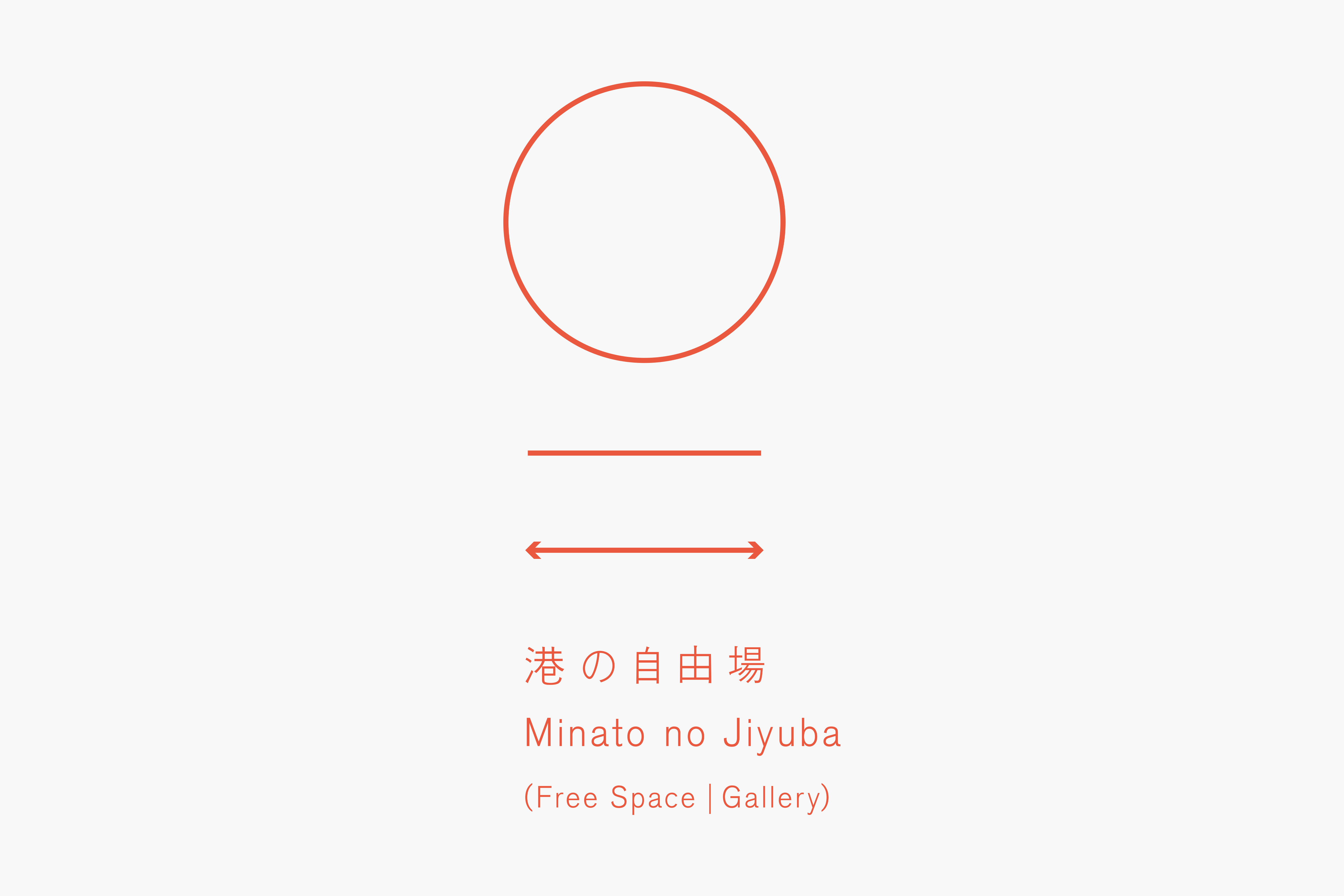
加え、各種イベント、ワークショップの主催やスペースの提供を行う「港の自由場」。風や光、波や音が打ち寄せる憩いの場となるこのスペースを、港の地図記号である錨(いかり)をモチーフに、場や太陽を表した上部の○、波や人やものの往来を示した2本線で、活気ある港の風景を表現した。
人やものが循環しながら、想いや暮らし、感度が幾重にも重なる場所でありたい。はじまりからこの先までずっと、食をメインに新しい価値が羽ばたく場所を目指し続けている。
‘Umineko-do’ is a complex facility with a shared kitchen and free space, utilising a 110 years old storehouse in Mitsuhama, a port town of Matsuyama, Ehime. Based on the project’s theme of ‘the place where everything begins with the sea’s breeze,’ we have been consistently involved in it by producing the logos, promotional tools, products, as well as sign designs to help it become a space where various people, things, and values gather and expand.
The logo is designed based on the shape of a black-tailed gull (umineko) illustrated with a technical drawing style to add laboratory-like nuances to the friendliness of the animal. The motif of the bird is a reflection of the hope for new possibilities and values to be born and grow out of this place. In addition, we also designed a logo for MINATO-CHORISHITSU, a shared kitchen with permissions for restaurant businesses and confectionery businesses, that is a part of Umineko-do. The concept of this shared kitchen, which is to provides opportunities for foodrelated startups, is expressed in its logo, in which a kitchen knife, an important cooking tool, and a motif of waves and ships, reminders of the location of the facility, are combined. Adding to that, the number 3710 at the bottom represents the Japanese pronunciation of the word ‘Minato’ (mi=3, na=7, to=10). The symbolic expression leaves an impression.
Another part of the complex facility is ‘Minato no Jiyuba’, a multi-utility space that can accommodate various events and workshops. The logo of this place of relaxation where winds, light, waves, and sounds overlap together, is a combination of the motif of the anchor, a map symbol of a port, and a circle that represents a space and the sun on top. The double lines at the bottom represent the movement of waves, people, and things, as well as the town’s lively harbor landscape.
We have tried to express the hope that this will be a place where people and things circulate, and where thoughts, lifestyles, and sensitivities overlap intricately. From the beginning to the future, we hope that it continues to aim for providing a place where new values grow with food as the main focus.