Hatsuyukihai
- Client :
- Kyouwa Syuzou
- Term :
- 2019
- Works :
- Package/ProductsGraphics
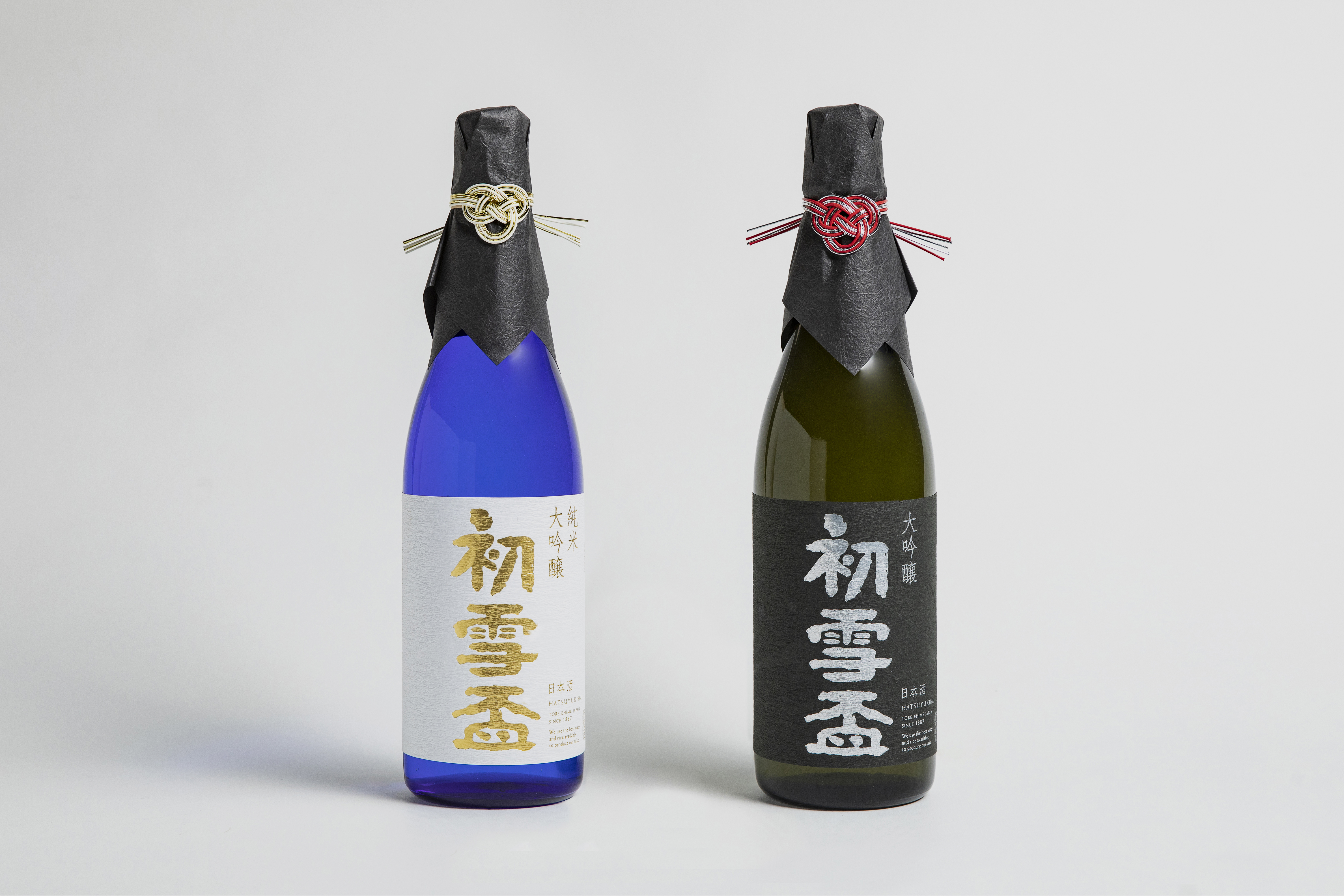 Bottle
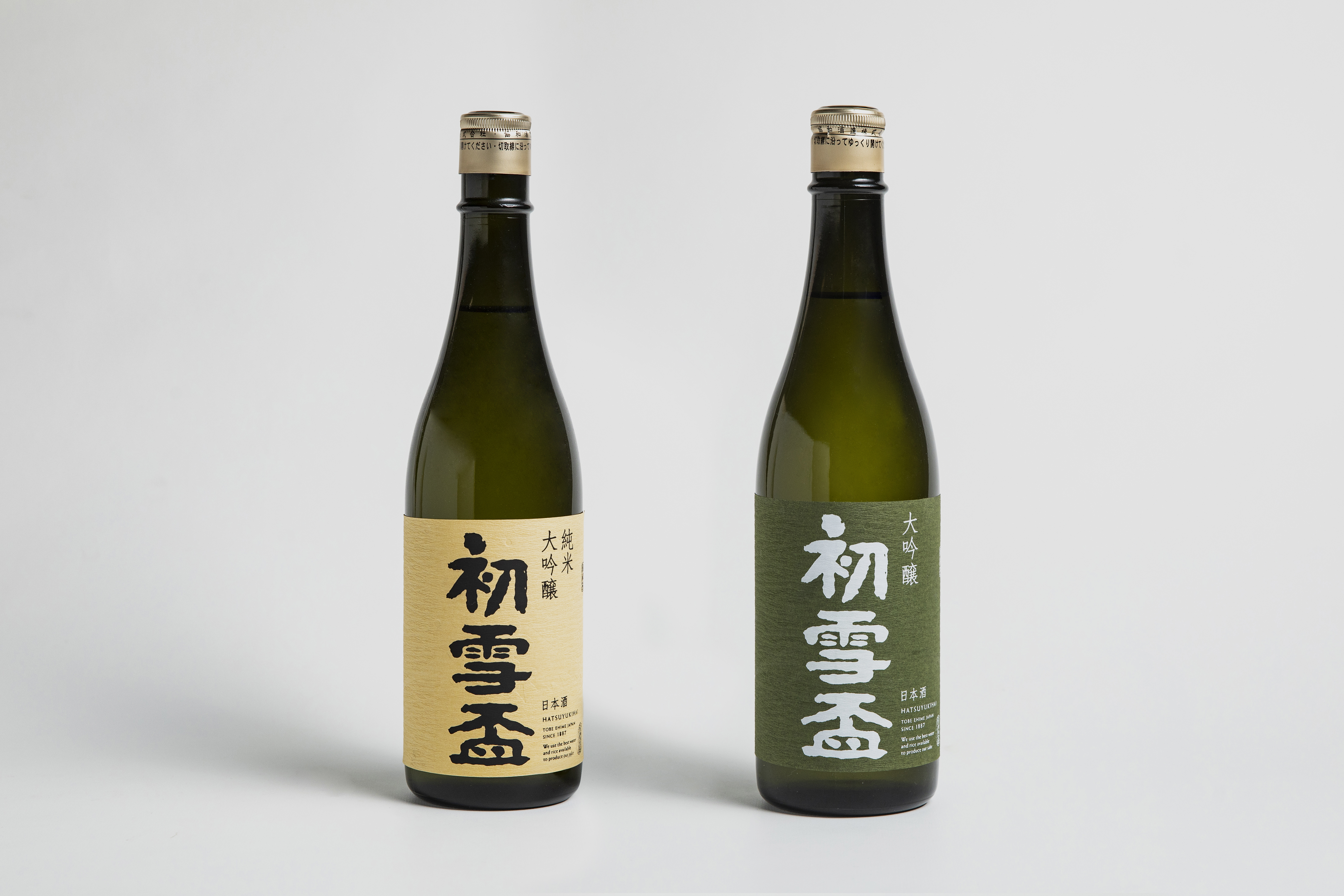 Bottle
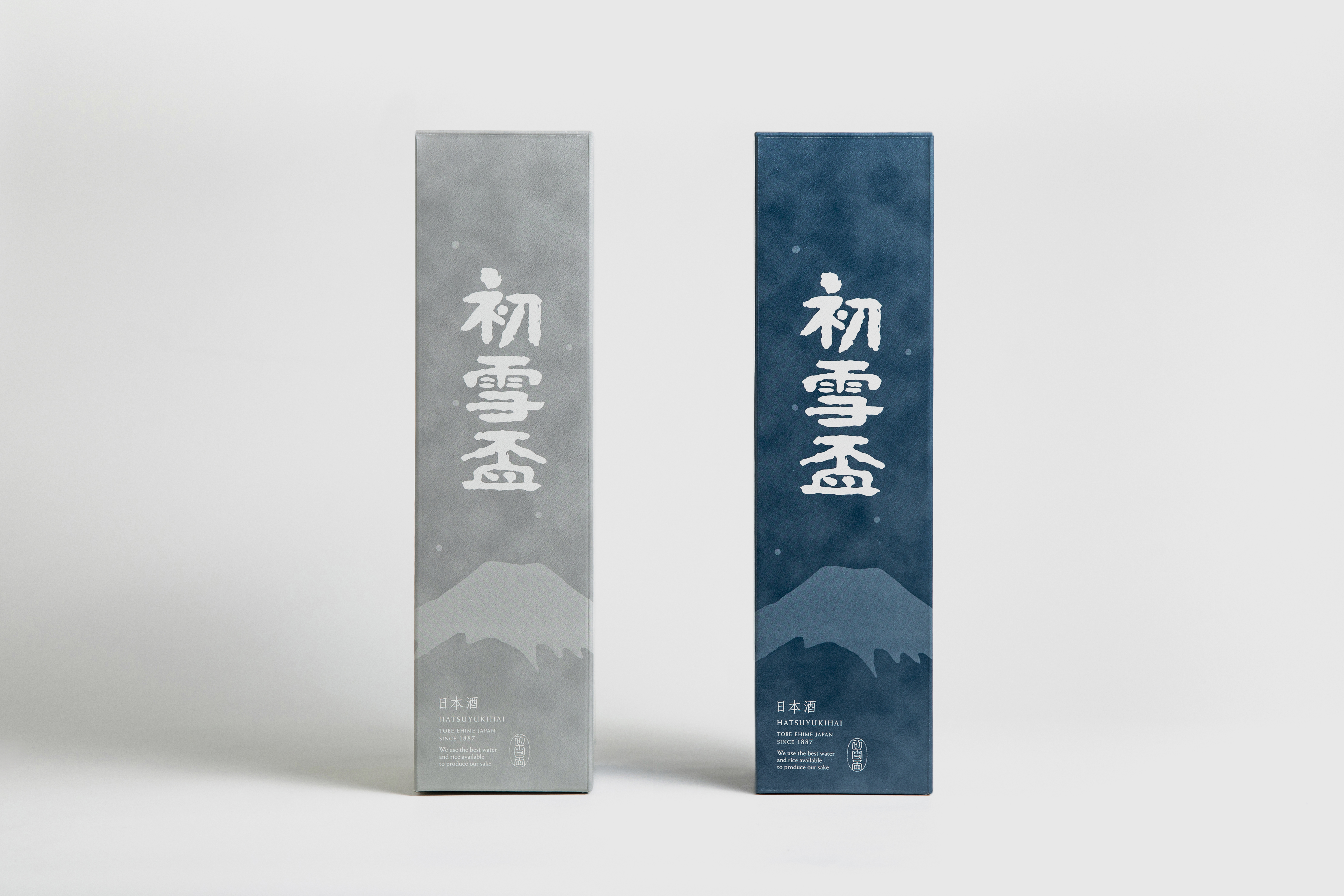 Box
Box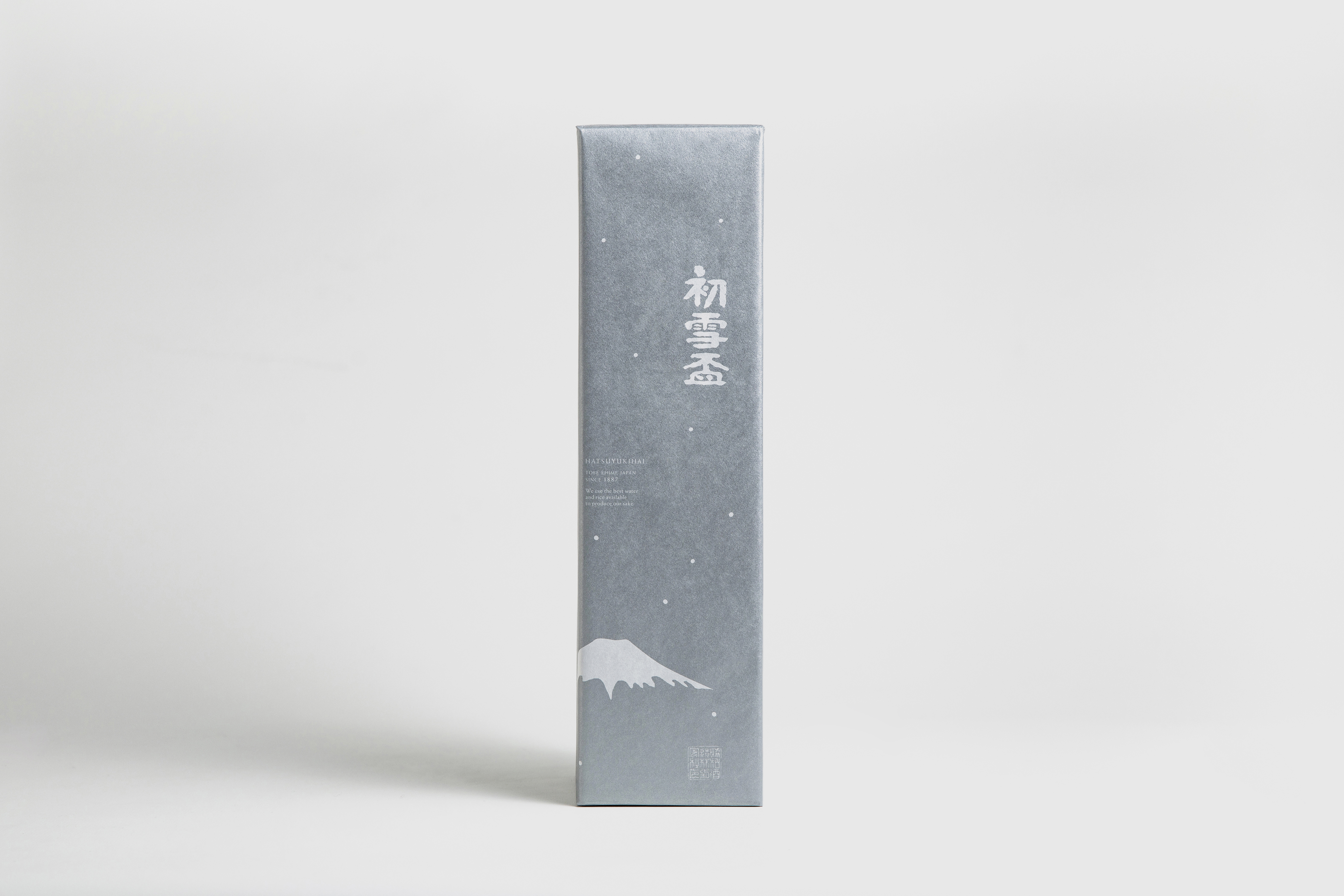 Wrappingpaper
 Paperbag
 Bottle
雪をかぶり凛とそびえる霊峰富士より命名された、協和酒造の主力銘柄である『初雪盃(はつゆきはい)』。Hatuyukihai -Mon-の制作と合わせて、こちらも見直しが図られた。
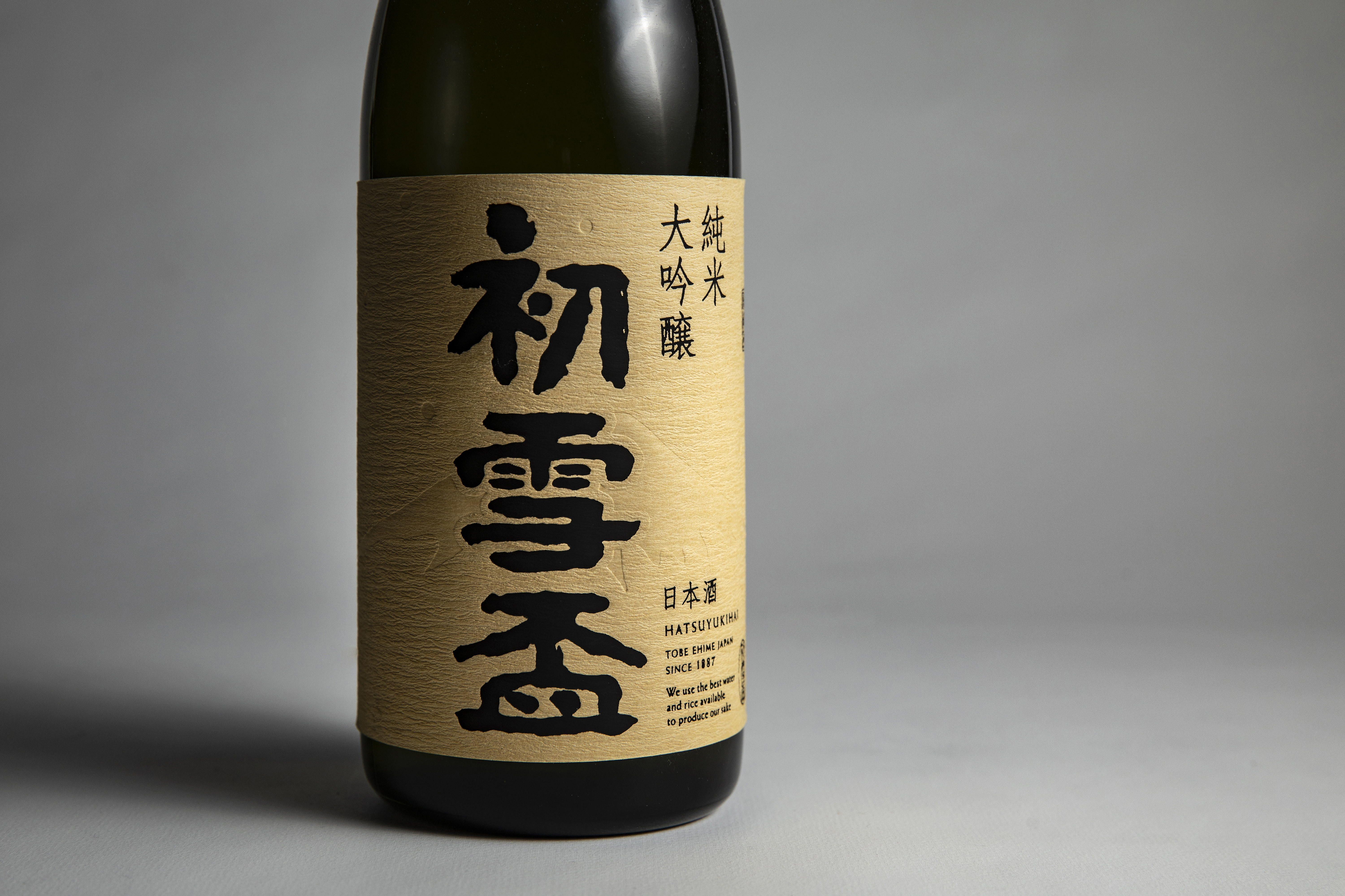
銘柄の中でも精米歩合によって段階的に分類されており、個々に増刷や改良を繰り返す中で、全体のデザインにばらつきが出ていた。そこで全体の軸となるコンセプトとして「雪をかぶり凛とそびえる霊峰富士」を再設定し、リ・デザイン。初代から使われている書字は残しながら、“霊峰富士“と“初雪“を図案化しラベルに配した。加え、書式の統一や日本伝統色による色設定、紙質・印刷加工等の仕様設計に至るまで、同銘柄内の見え方の統一と精米歩合による分類とのバランスに気を配った。
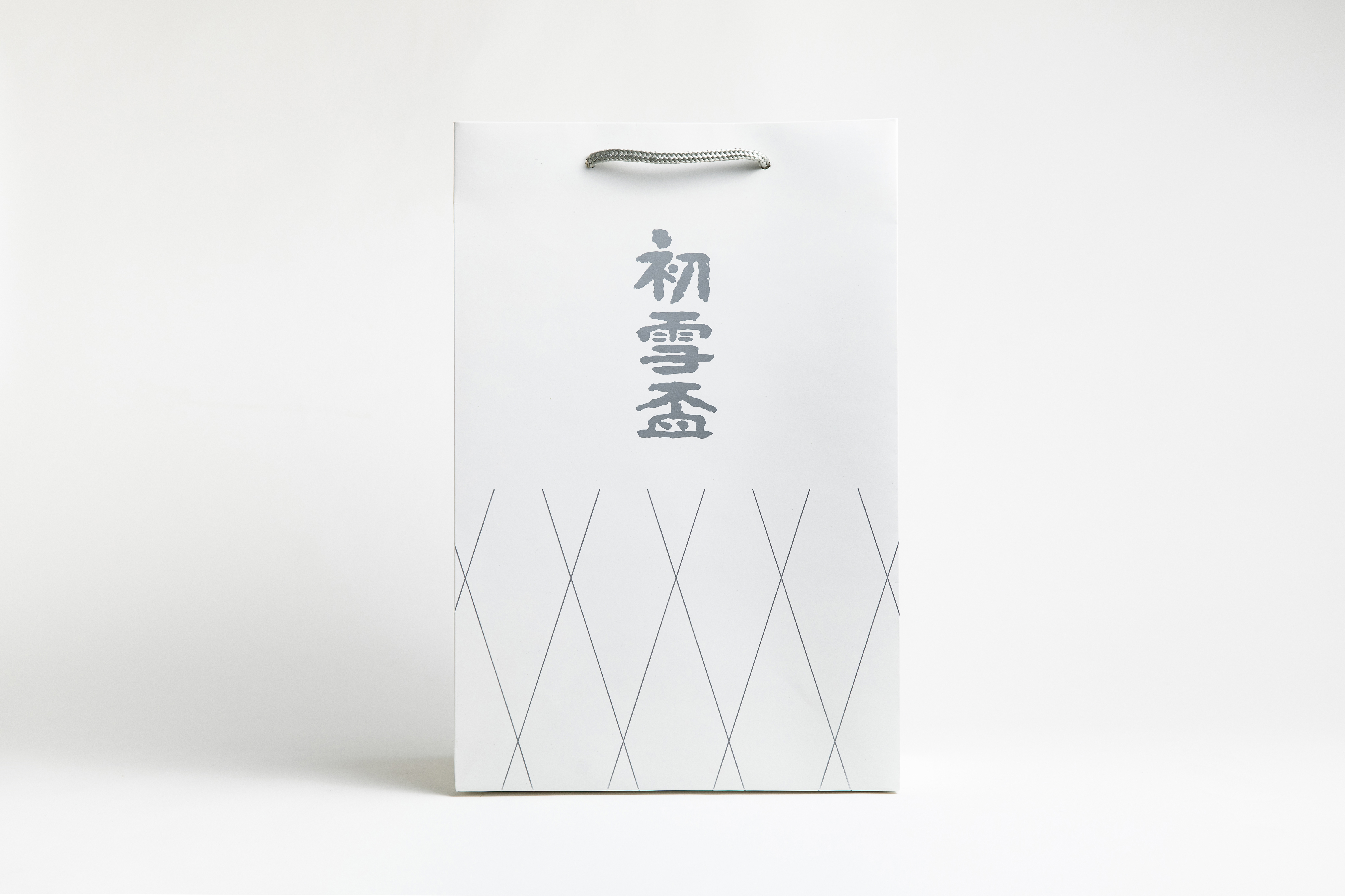
全19種のラベルデザインに始まり、化粧箱から手提げ袋、包装紙に至るまで統一した顔つきとし、130年を越える伝統を受け継ぎながら、次なる時代へと繋がるデザインに仕上げた。
Hatsuyukihai series, named after Mt. Fuji, the snow-capped sacred mountain, is the flagship brand by Kyowa Syuzou brewery. At the time of the introduction of their new product Hatuyukihai -Mon-, the whole series of products went through a review.
Their sake products were classified in accordance with rice-polishing ratios and as the package of each product went through several reprintings and improvements which resulted in the lost integrity of designs. We revisited to the original concept of the product, ‘Mt. Fuji, the snow-capped sacred mountain soaring to the sky with dignity’ as the core of the re-design. It was decided to maintain the calligraphy used from the first and original package design and the stylised phrases ‘Mt. Fuji, the sacred mountain’ and Hatsuyuki (first snow) were added to the design of the label. From the the uniform format, colour settings based on traditional Japanese colours, to the specification including the choice of paper and printing methods, we paid extra attention to create a unified look which allows the series of products to be recognised as the same brand. At the same time the bottles and labels come with different colours which match the classification by rice-polishing ratios. From the label for 19 different products to gift boxes, shopper and wrapping paper, we created designs to be handed to the next generations, succeeding some 130 years old tradition at the same time.